"Simplifying travel planning and journaling while connecting with a social network of travelers that share inspiring journeys"
#inspire #journey #explore #connectwithpeople #memories
#experiences #travelplanmadeeasy
My Role
I chose tourism and travel to focus on as there is no app out there that covers all aspects of travelling. As part of my research, I decided to dig deep on all existing travel applications - their features, accessibility, ease of use and shortcomings. It unravelled interesting findings which helped me gain better insights.
By conducting user interviews and surveys, I furthered my understanding of the pain points, motivations and behaviour of the users which guided me through my next 4 weeks of product design/ usability testing and another 2 weeks of branding the product by creating a marketing website and exploring other platforms of use.
Device
Timeline
Tools Used
Android (Mobile, SmartWatch)
8 Weeks
Sketch, Invision, Adobe XD, Adobe Photoshop, Google Docs, Google Slides
Origin
Why Traverse?
A whole lot of applications are used for travel planning starting from looking for inspiration, planning and embarking on the journey itself, to finally storing and managing pictures. It is merely impossible for a traveller to plan a trip without having a journey map of places visited by people in his network. Travelling to previously visited places isn’t easy either without any way of saving the entire route/map.
And most importantly, the main takeaway from journeys are moments of joy and memories. But the painstaking efforts to craft and document a travel journal is weary and exhausting that we often refrain ourselves from preserving those unique experiences.
Who is being impacted?
The Challenge
Create Compelling User Experience
To provide a unique user experience that covers all aspects of travelling and to create an identity that stands out from already existing travel apps. To keep it local, social and to keep it simple.
The Approach
Understanding the Problem Space
The first step was to identify the current and future state of travel and tourism by heat mapping based on the evolution of different travel apps over decades. This led me to a whole lot of “How might we” questions on the potential exploration possibilities. In order to keep my research broad, I performed both quantitative and qualitative analysis. My key findings are summarized as follows:
I also created a survey of travel apps, internet access and usability by considering the following parameters - Demographics, Expectations, Experiences, Preferences and Patterns.
Market & Competitor Research
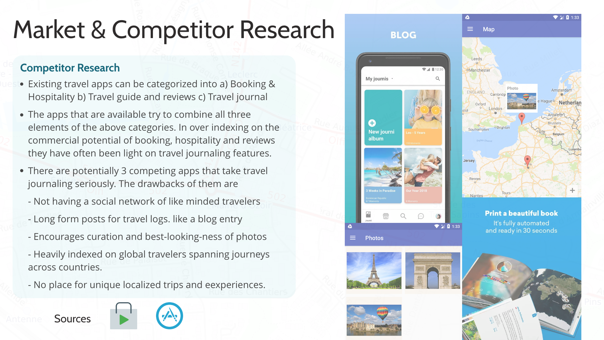
The next step was to conduct customer and market research to drive the planning phase. It led to the understanding of existing travel app categories, their drawbacks and their ratings on appstore.


The Discovery
Customer Insights
The most efficient way to completely understand a problem space is to empathize with people experiencing the problem. This is personally the most interesting part of the design thinking process - User Interviews - which paves way for the ideation phase.
The identified pain points, goals, motivations, behaviours guided the creation of personas to continue the design process with focus on users and their experiences.
"With the primary persona in mind, creating experience map helped to visualize the end to end experience of Archie Costa going on a road trip. It also helped identify opportunities for design intervention."
User Insights
The Mission
“How might we inspire and connect like-minded travelers, while simplifying travel planning and the process of creating a journal that continues to live beyond their destinations?”
The Vision
Project goal
The goal of the project is to create and connect a unique social network of like-minded travellers to gather inspiration for travel by simplifying travel planning and to provide simple and efficient authoring of a customizable journal to share their moments/experiences.
The Design Process
Ideation
The experience map helped in the construction of task flow of the user which formed the basis of ideation sketches. Through rounds of sketches and iterations, my design evolved in 3 different stages - Paper sketches, Med-fi wireframes and after 2 rounds of user testing with 5 testers per session began the process of creating a visual identity of the product by choosing a primary colour. Then evolved the high fidelity wireframes and prototype.
Task Flow
Paper Sketches
The major breakthrough of the ideation phase is the idea of allowing the users in the social network to view fellow traveller's journey map and customizing it according to their preferences which eliminates the effort and time required to plan a similar trip to the same destination.
"Major breakthrough was the idea of allowing users to view fellow traveller's journey map and customizing it according to their preferences."
Medium Fidelity Design
Three major improvements were made based on user feedback and suggestions.
1. To have the option to switch between list view and album view
2. To receive confirmation/undo feature when trying to remove stops
3. To see visual cue that moment is added to journal
Usability Test Findings
As the usability test findings after second round of user testing was satisfactory, I decided to create a visual identity for my product with focus on brand name, colours and brand values.
Visual Identity
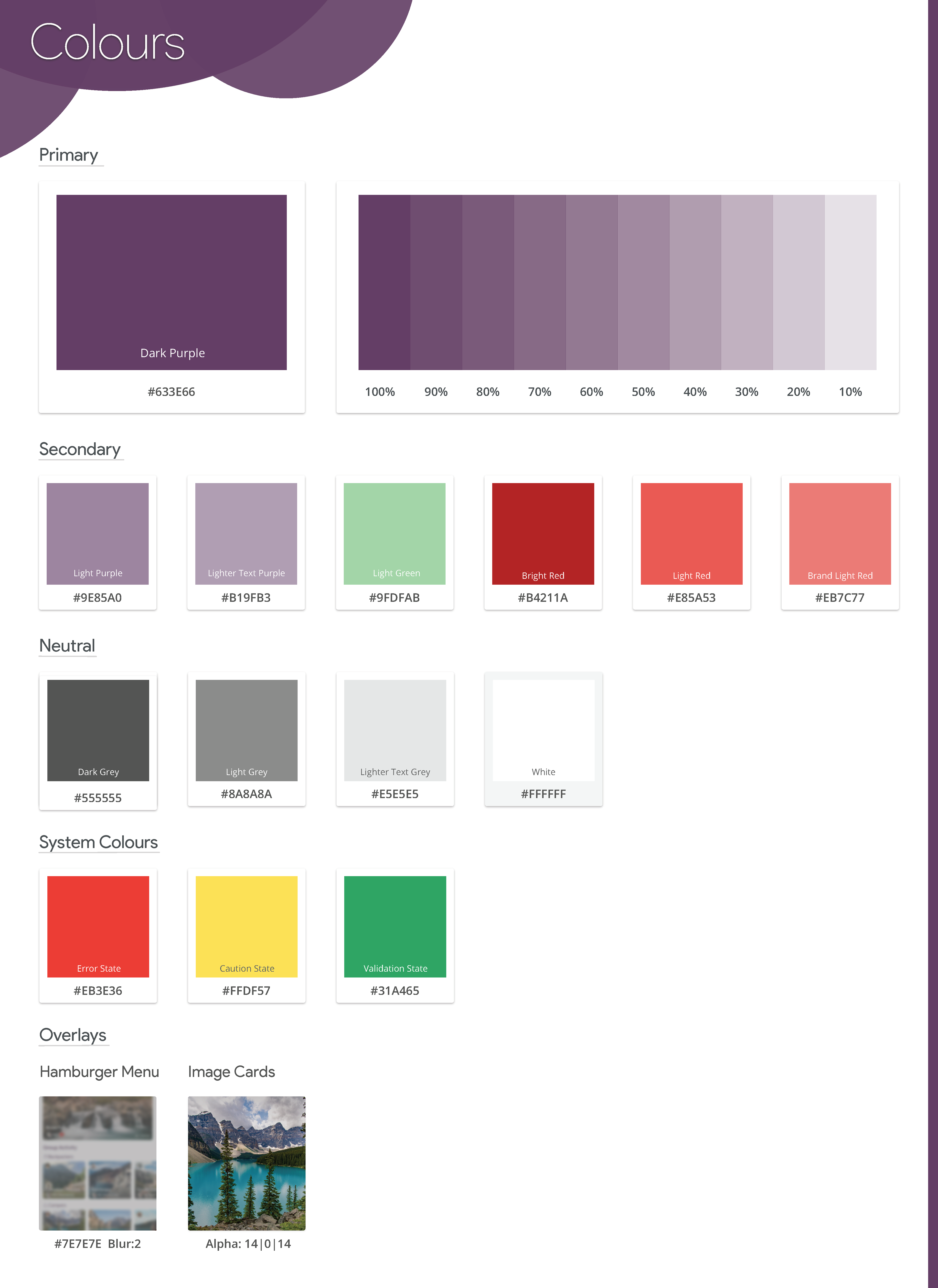
A list of adjectives that describe brand values and brand identity are developed which guided the choice of brand colour. Purple was chosen as the brand colour as it signifies creativity, grandeur, dignity, independence and pride.
Traverse was chosen as the brand name as it means journey and 'verse' means poetry, words which translates to moments/journal.
The word Traverse is spread out to allow room for characters which symbolizes space and freedom to move around. The word mark was designed to convey warmth and orange-purple gradient was chosen to represent morning dawn and night skies.
High Fidelity Designs
The high fidelity wireframes were designed in sketch and the prototyping was done in invision. Some micro-interactions were created using Photoshop and Adobe XD, to showcase of how each elements respond to user's interaction with the product.
Get Inspired
◦ Find travel inspiration from your network
◦ Toggle between album and list view
◦ Journey map of route attached to journal
◦ Add to planned trip by selecting "I'm Inspired"
Personalize Journey Plan
◦ Add to planned trip by selecting "I'm Inspired"
◦ Plan a journey by customizing it.
◦ Add, remove or reorder stops on journey map
◦ Save journey to "planned" list to embark later
Quick Journaling
◦ Log moments - take picture or add from gallery
◦ Choose filters and describe moment instantly
◦ Moments are grouped and added automatically
◦ Quick on-the-fly journaling
UI Library
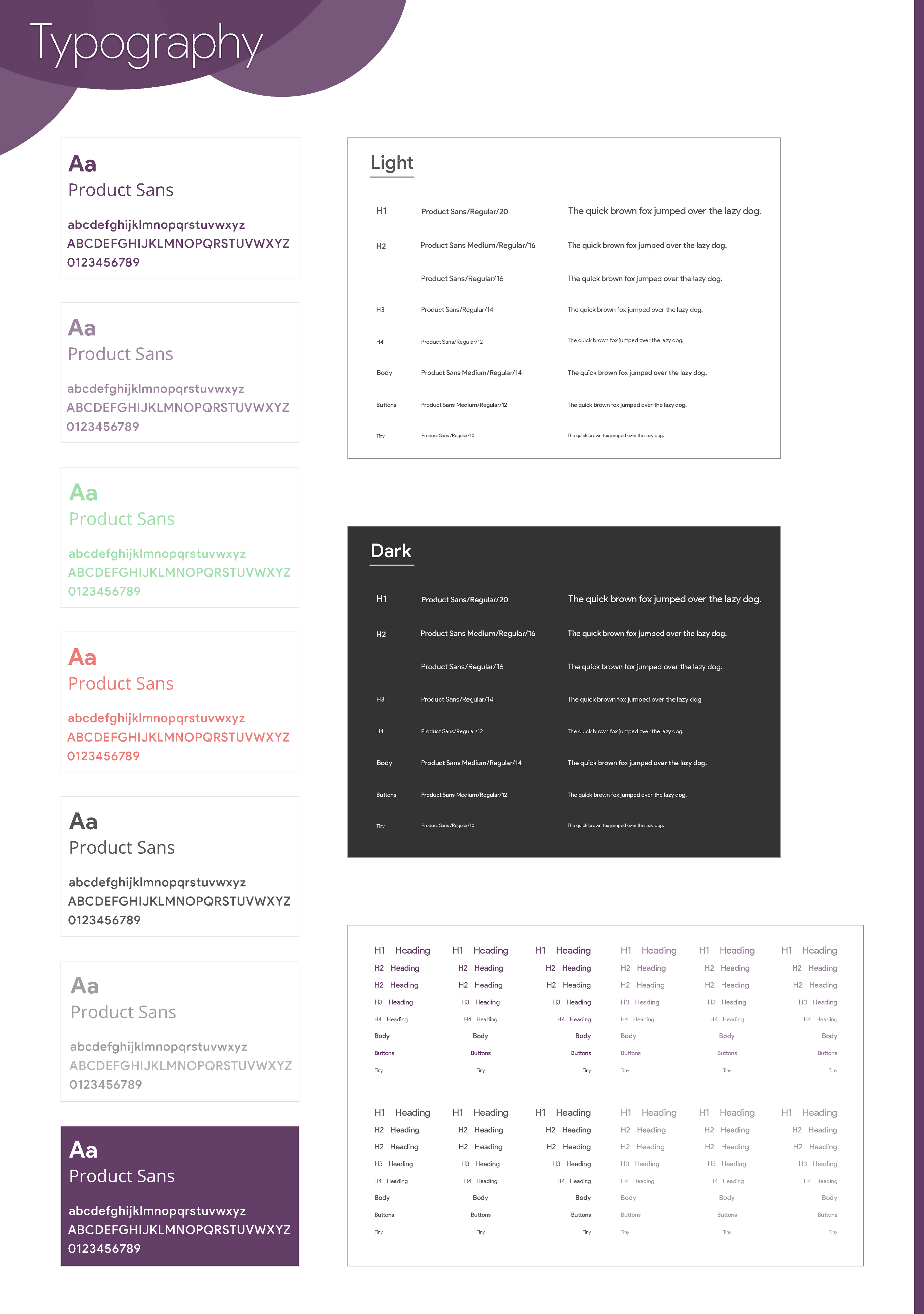
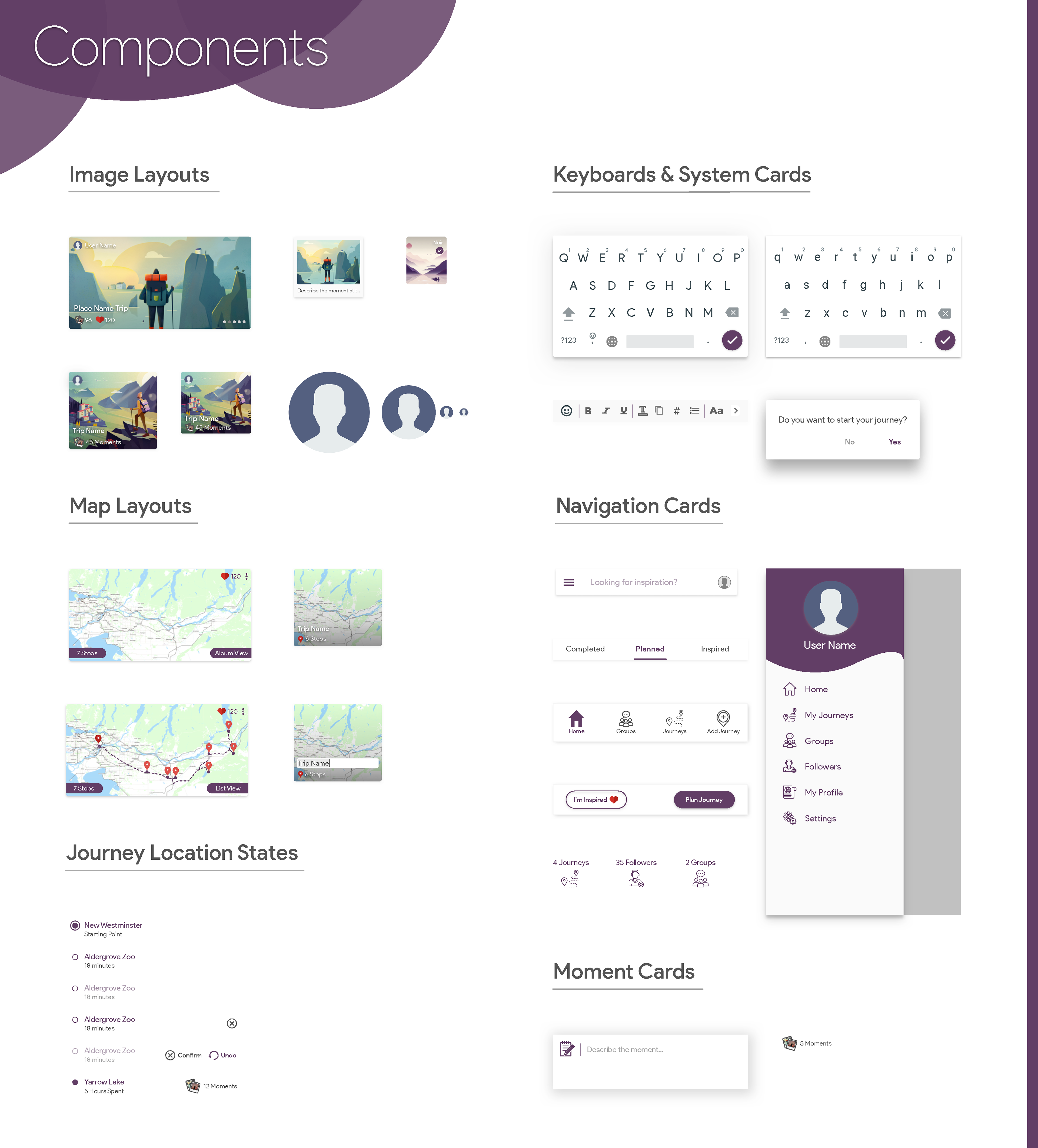
Alongside the finished interface designs, an exhaustive UI library that covers colours, typography, cards, components, buttons and their interaction states were created to allow for reusable designs and consistency.


One size doesn't fit all
Exploring Other Platforms
User experience requirements vary when the implementation platform changes. The following is a design exploration process for taking Traverse multi-platform and providing an integrated watch to phone continuum experience.
Multi Platform Experience
Feature Spotlight - Add moment continuum
◦ User reaches destination / Stumbles on something interesting
◦ User wakes his smartwatch and is able to tap "add moment"
◦ User is presented with the three journaling options
◦ On selecting any of the options the control is sent to the phone
◦ User's phone is unlocked (smart unlock on watch connected)
◦ Traverse app opens directly to the action eg: "Take Photo"
Design Impact
Inspiring Journeys
Traverse encourages people to connect with fellow travellers to explore unique places within their country. It inspires people to travel and the instant journaling feature lets them treasure their memories/experiences beyond their destinations.
Convenient tool
Traverse simplifies travel planning by tagging each journal with the journey map. This enables to customize journey map of fellow travellers thus reducing the time and effort required to plan trips.
Future Thinking
What new mechanisms will be put in place for listening to users?
To have a support section available not just on the marketing website but also on the menu in the mobile app which lets the user to send feedback on the product at any point of time. In order to stay customer focused, requesting feedback from the users over a year, after the launch of the product on a monthly basis would ensure that the customers are satisfied with the product.
How will you recognize larger patterns in feedback so that action can be taken?
Based on the keywords present in the feedback, the pattern is identified and if more than 25% of the total users have the same issue, it will be addressed immediately and updates will be made available as a product's life is directly proportional to customer's trust on the product.
