"Empower music industry professionals by providing meaningful insights
on the reach and performance of their music"
on the reach and performance of their music"
#artists #recordlabels #musicperformance #datadrivendecisions
#audienceengagement #musicreach #analytics #dashboard
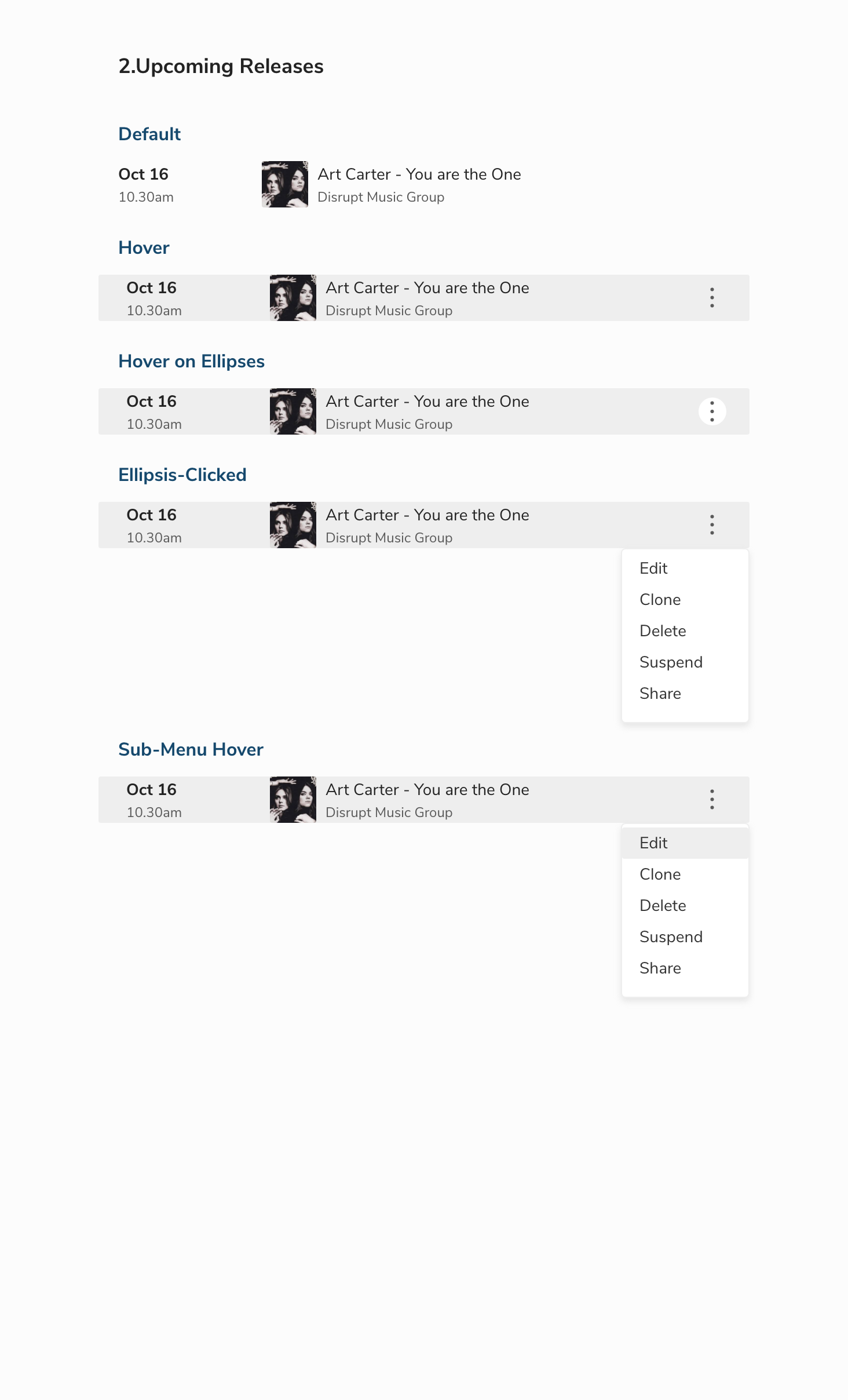
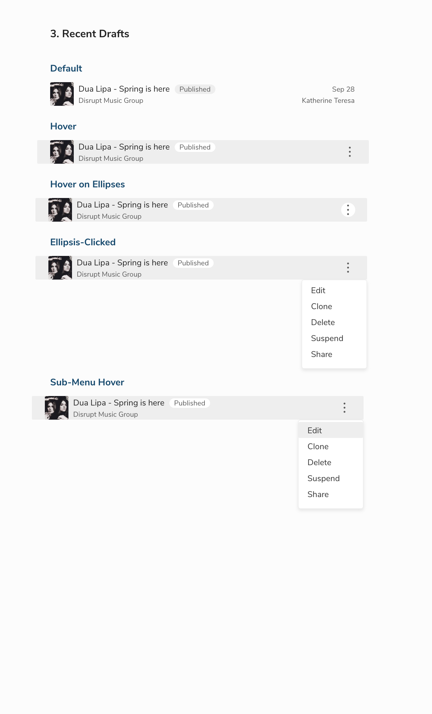
Overview
Caster is a music promotion and distribution platform that empowers artists, and record labels by connecting their music to radio promoters, influencers, and tastemakers. Caster users upload their music, add metadata, create a promotional email campaign and send it to Play MPE contacts to make their music heard on the radio.
The Problem
Caster users who send their music and promotional campaigns to radio promoters, media, and tastemakers do not have any insights into the reach and performance of their music. This was a huge setback for the artists, record labels, and music promoters as they were not able to make informed decisions on other marketing/promotional campaigns.
“How might we help artists/record labels/music promoters to track the performance of their music and empower them to make informed decisions on their marketing/promotional campaigns?”
My Role
I led the entire design process for the dashboard project from research on what success means to an artist/record label, competitive audit, user interviews, creating value proposition of the product to rough sketches, medium fidelity designs, usability testing, high fidelity designs, prototyping and hand off designs to the developers. During the process, I conducted design workshops to get the developers team and product team involved with the ideation.

Device: Desktop/Laptop (Web app)
Timeline: 8 weeks
Tools Used: Adobe Xd, Miro, Jira, Google docs, Google Sheets, Zeplin
Timeline: 8 weeks
Tools Used: Adobe Xd, Miro, Jira, Google docs, Google Sheets, Zeplin
The Approach
Understanding the problem space
To have a broad understanding of what success means to an artist/record label, and to understand their goals and motivations, I conducted quantitative research with the following research goals in mind:
⦿ To understand what success means to an artist/record label
⦿ To identify current market trends and how artists track the performance of their music
⦿ To conduct a competitive audit of PlayMPE’s competitors and to understand how they present key insights to their customers
Through extensive research, it became clear that success to an artist means reaching a broader audience, increasing listenership, good return of investments and ultimately getting their music heard on radio. I created a summary on common artist/record label goals, needs and motivations based on the findings.
Competitive audit
I conducted a competitive audit to understand the business model, features, strengths, and weaknesses of our competitors. This helped me to identify the gaps in our competitor's product and opportunities for PlayMPE’s Caster.
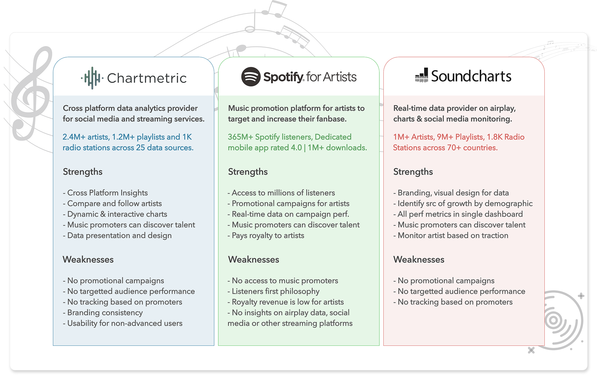
Gaps in competitor’s product
Doesn’t provide a holistic view for record labels
⦿ on their releases (Number of releases per month or over a period of time)
⦿ on which of their recent releases are gaining traction
⦿ on which of their releases needs special promotion
Opportunities for PlayMPE
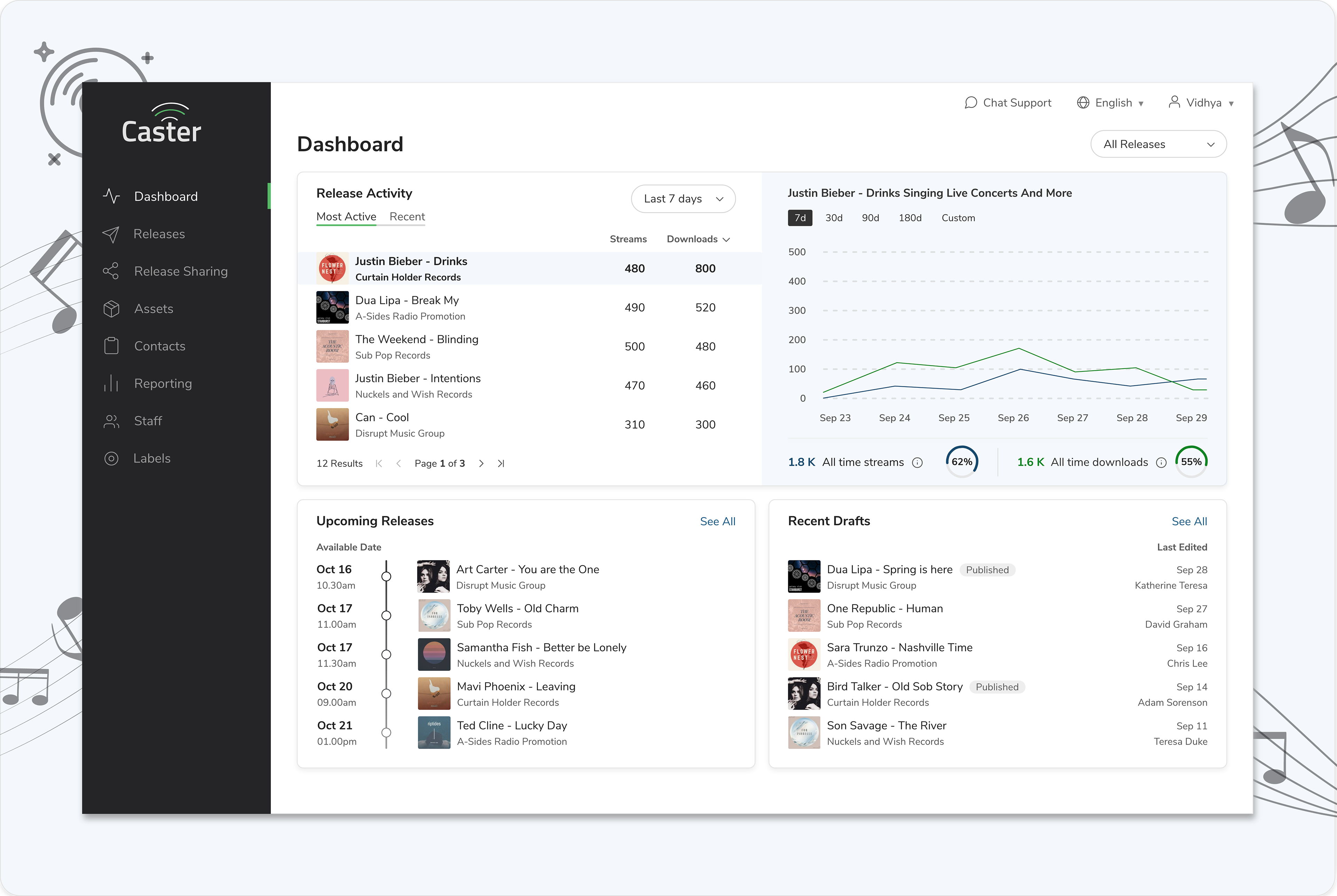
⦿ Provide a holistic view of release performance over a period specific to a label
⦿ Provide analytics on recent releases that has gained traction
⦿ Help record labels focus their promotional efforts on releases that needs traction
⦿ Provide total number of contacts and unique recipients of the release
⦿ Provide analytics on contact list health
⦿ Make informed decisions on which contact list to send your promotional campaigns (e.g. genres that do well with certain lists)
⦿ Offer a subscription model by providing analytics on airplay data
⦿ Offer record labels targeted promotions on Player for releases that are not gaining traction
⦿ Encourage record labels to complete metadata for tracks to have more visibility by showing them the impact (traction it gets) by providing them data
⦿ Provide data on release performance of an artist which would help labels promote PlayMPE to artists (from my understanding of one of the excerpts from past user interview)
The Discovery
Customer Insights
The most efficient way to completely understand a problem space is to empathize with people experiencing the problem. This is personally the most interesting part of the design thinking process - User Interviews - which paves way for the ideation phase.
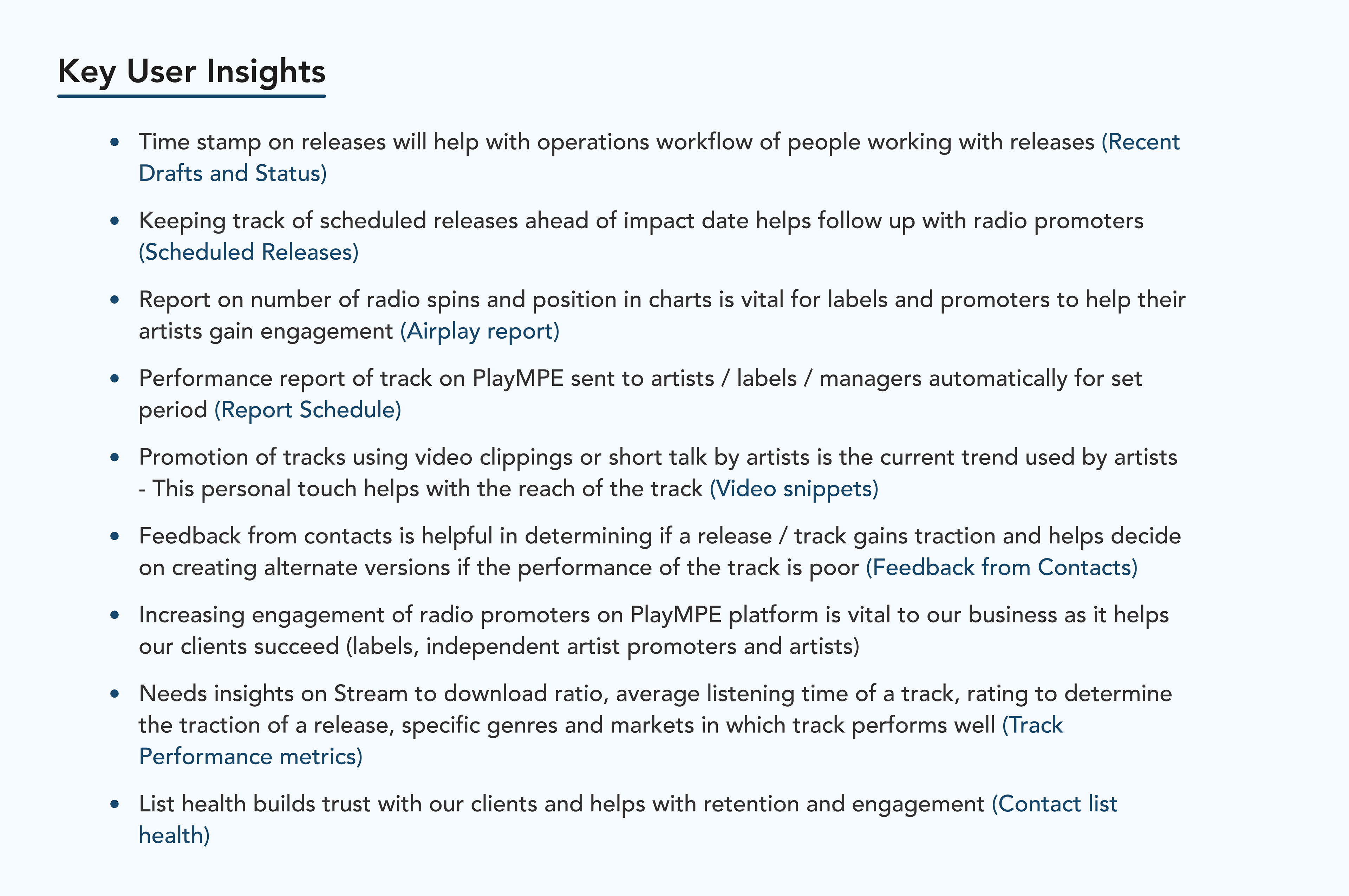
A total of eight users that fall under the four different personas that I interviewed for the dashboard project and their key insights are as follows:
⦿ Operations Manager at major labels
⦿ Head of Release Management at major labels
⦿ Independent artist promoters
⦿ Artists
⦿ Operations Manager at major labels
⦿ Head of Release Management at major labels
⦿ Independent artist promoters
⦿ Artists
I then created a value proposition canvas to ensure that the product is positioned around what the customer values and needs. This was also the time I met with developers and the product team to share my research findings and to understand the technical limitations and available data for dashboard features.
Ideation
With the research insights, I moved on to the ideation phase of the design process. I conducted a design workshop for the developers and product team to collaborate and produce rough sketches. We then voted on ideas that we considered are in the right direction towards building what the customer wants out of dashboard.
Wireframes
I narrowed down the options taking into consideration the most voted ideas and created three medium fidelity design options.
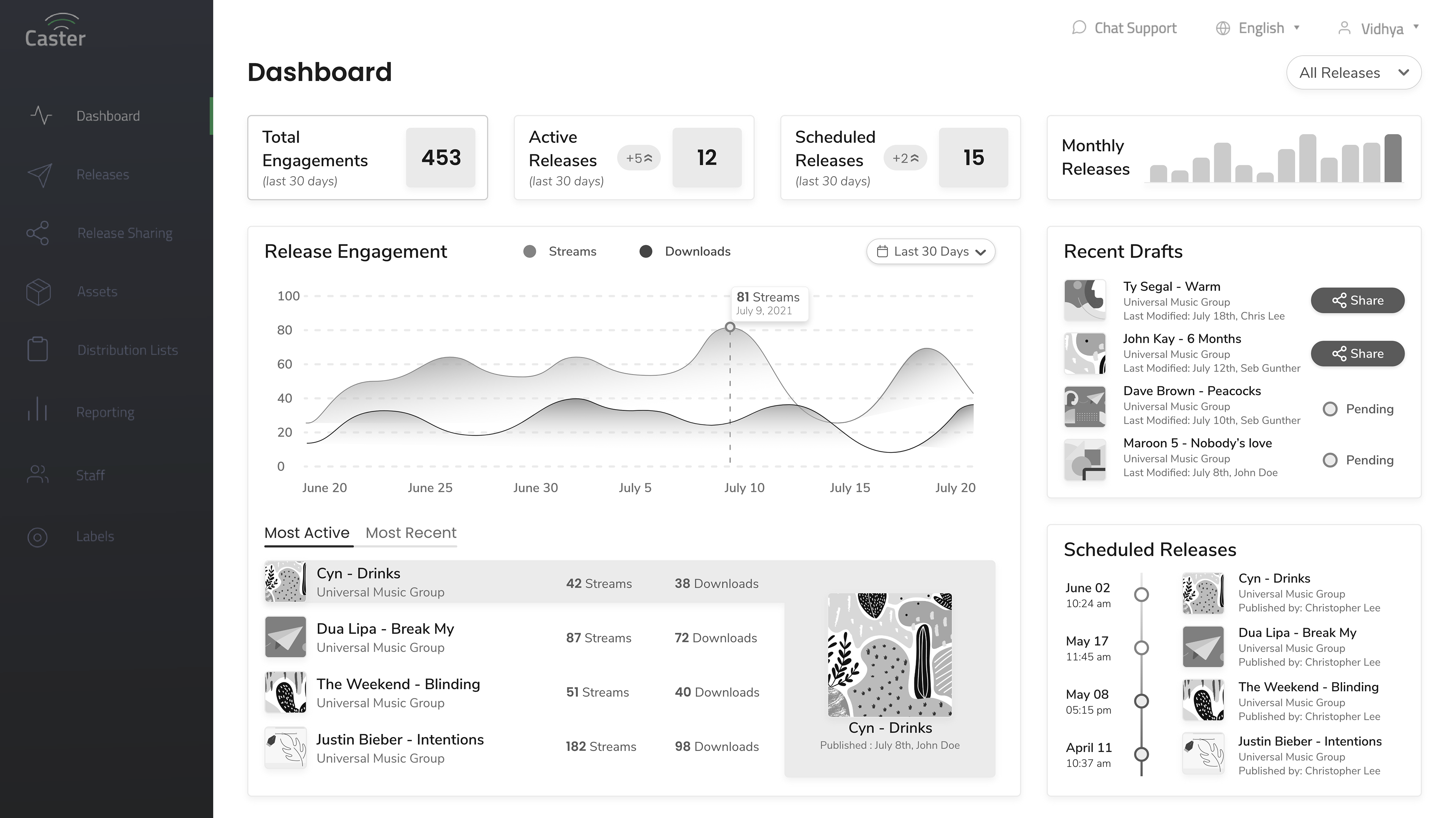
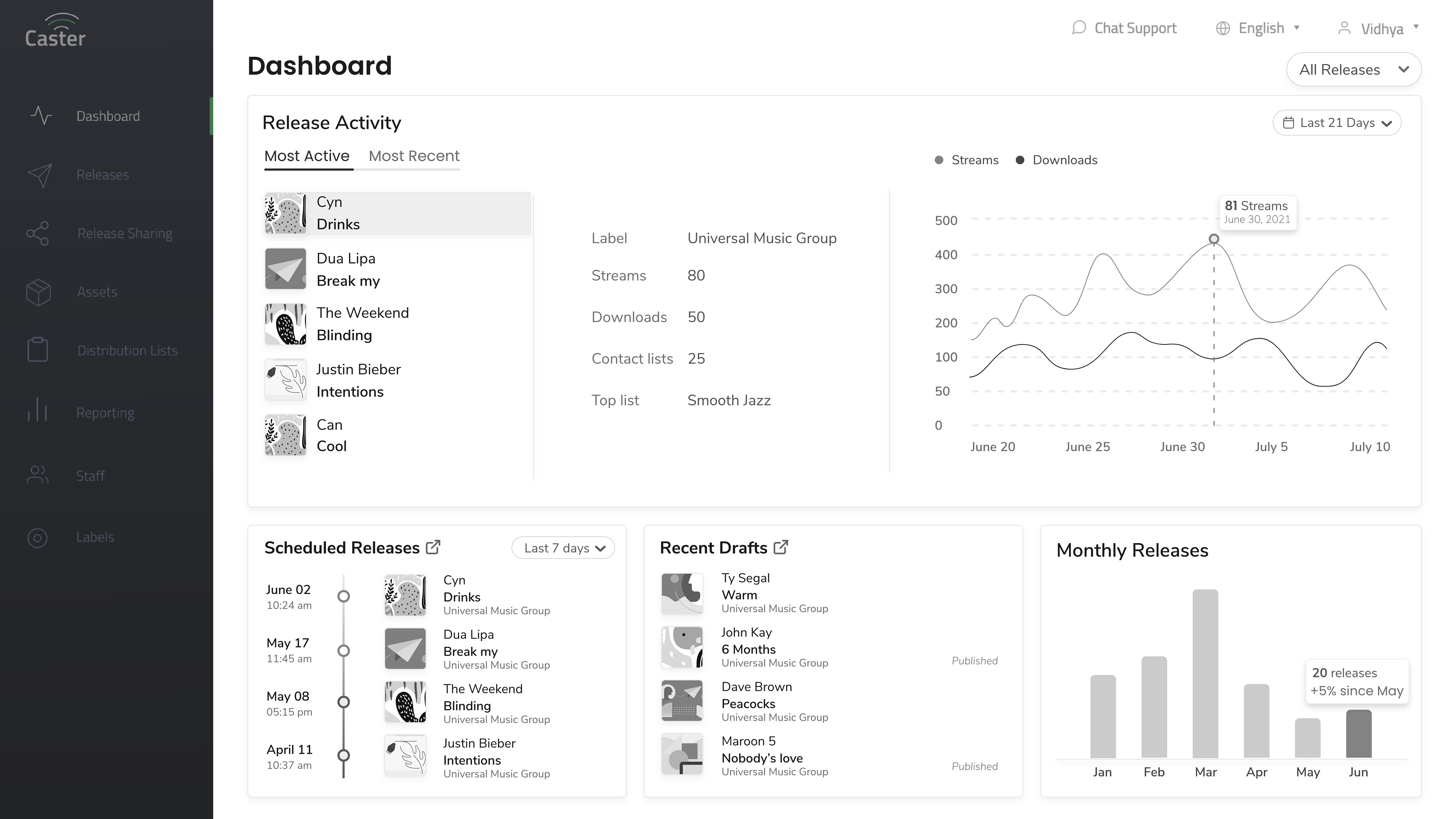
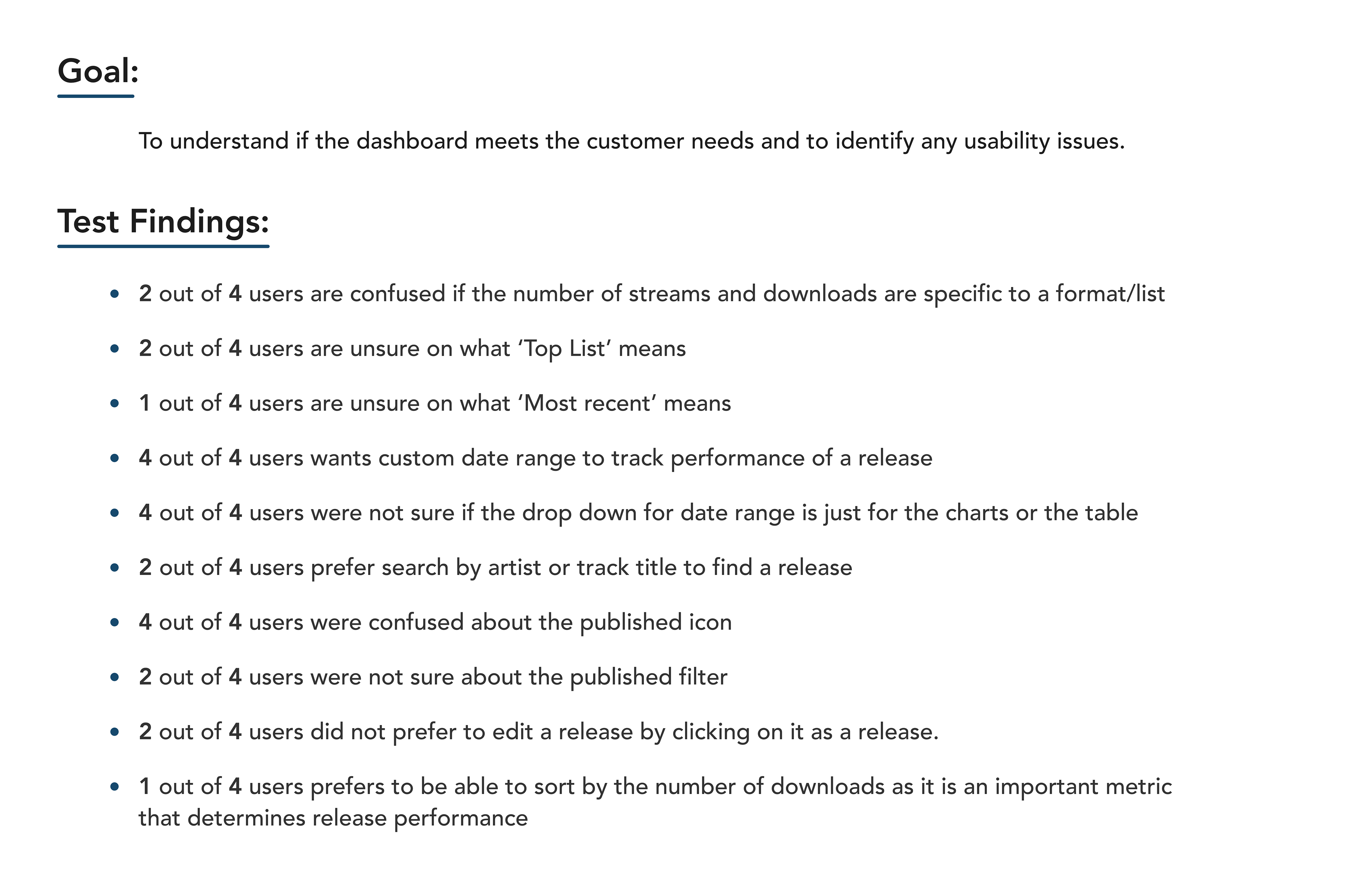
After discussions with the operations, product, and development team, we decided to move forward with option 3. I then conducted a moderated usability testing with 4 of our users each representing 4 different personas. The summary of the first round of usability testing is as follows
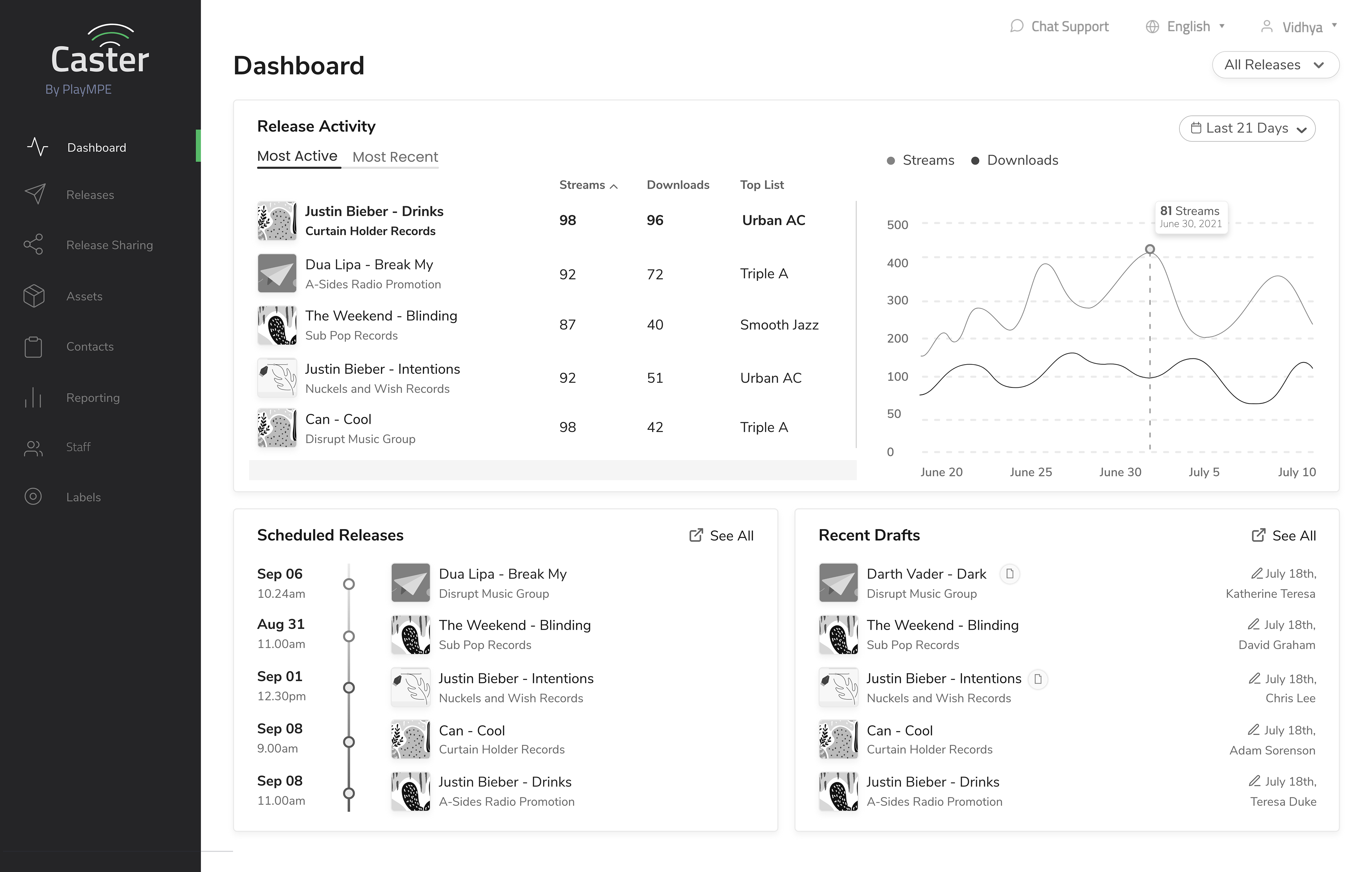
Transition to High-Fidelity Designs
Based on the feedback from users, I updated the wireframes and made the transition to high fidelity designs by using some of the components already in the design system and by adding a few new components for data visualization, timeline, etc.,

Prototyping and testing
I created a prototype of the high-fidelity designs to show the micro-interactions and the behaviour of the graph and conducted a second round of usability testing.
Key insights
⦿ Placement of the time range drop down was not clear if it represents the release activity or the graph
⦿ Better visual representation of the lifetime performance of a release
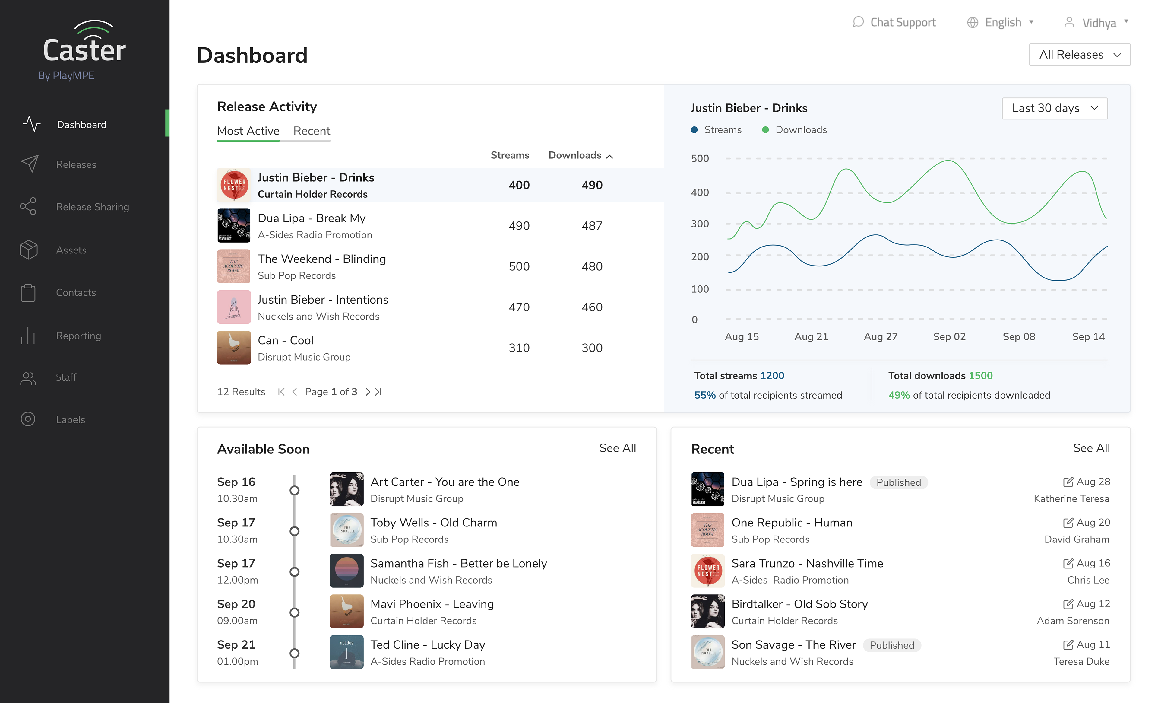
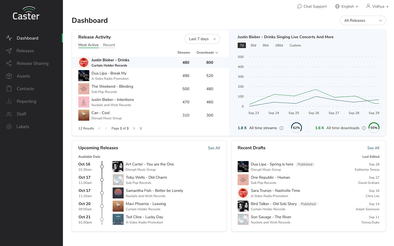
Updated High-fidelity designs


Prototype
Developer Hand-off