Disclaimer: This case-study is an academic evaluation of an existing healthcare website and how its user experience could be improved using a mobile app. I used the same images as on the website to faithfully replicate the brand experience in my designs.
"This case study was a key factor in me landing my first full-time UX Designer job @ Medimap in October 2019. I have continued the case study below the academic evaluation on how I went about re-designing the Medimap mobile app in 2020 as their UX Designer."
The revolutionary change
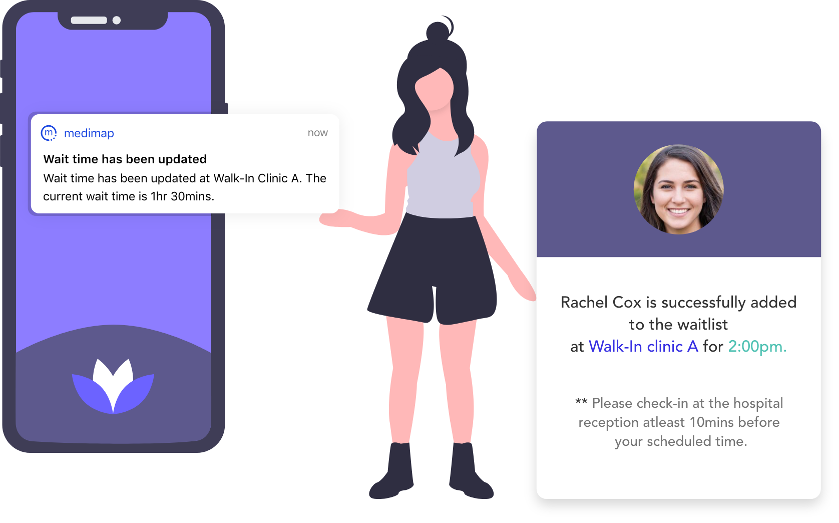
I have used Medimap website for my clinic visits and I was totally captivated by the idea which makes health care more accessible to everyone, especially, at times that they need the most. It reduces the amount of time a person spends on their clinic visit. It eliminates the agonizing pain of waiting for hours without knowing when one will be called in for treatment. By partnering with medical clinics, it gives you access to wait times at nearby clinics. It lets you check-in at a clinic that supports the feature and also notifies you of estimated wait times at clinics that don’t allow check-in.
With their mission to enable faster access to care while improving patient outcomes and patient satisfaction is a key milestone achieved in Canadian healthcare.
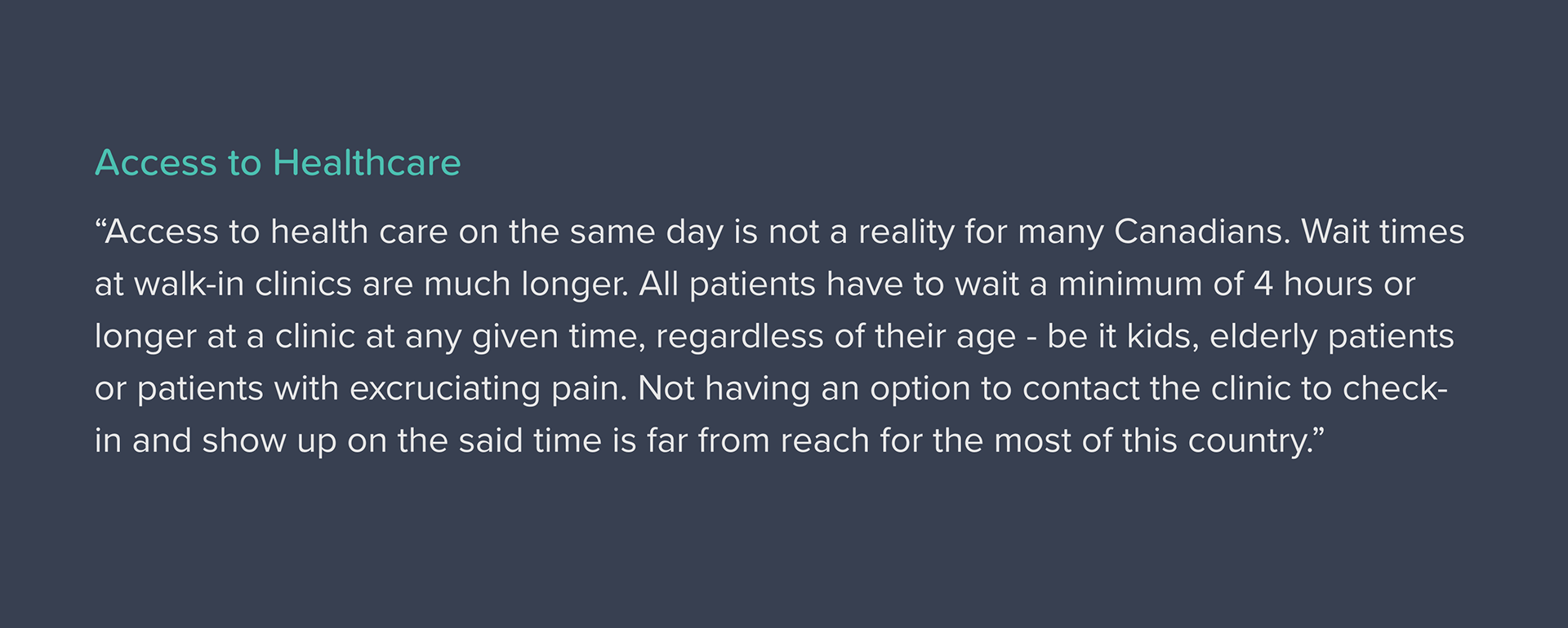
The Problem
I wondered why such an impactful application hasn’t been the word that is widely used by patients and clinics alike, to solve the woes of extended wait times in Canadian healthcare. After some research, I discovered that there was not a full-fledged app to have all the family members be part of Medimap. During the process, I also identified a number of usability issues on the website.
My high level goals were to:
◦ Make it easy to use for everyone, everywhere.
◦ Identify opportunities for improvements
◦ Improve the overall experience of users
The Challenge
Medimap has recently introduced an app to make it easy to allow online check-in and to set alerts to notify on estimated wait time at clinics. Unfortunately, the app is incompatible with the device that I own and I personally didn’t have a chance to use the application. Well before the application’s recent update and its advertising on the website, I found areas that needed improvement on Medimap website. I also learned from the reviews on both the play store and app store that the app can be improved on its overall usability, I quickly jumped to deep dive in, without taking a peek on their existing app to stay away from biases.
The Design Process
My take on how Medimap can be improved based on its usability issues (or heuristic evaluation principles by Nielsen Norman group) and possible future enhancements.
I worked on redesigning Medimap app before a recent update that was made available on September 24th, 2019. I want the app to be a part of every Canadian family longing to have faster access to health care, just a tap away.
“I approached the app redesign, bearing in mind the mission and the values that they stand for and the impact they are trying to achieve in the lives of the common man.”
I started on this project by analyzing all the features that are available on Medimap’s website - I tested out every single button and closely examined all the pages on the website and took note of all possible improvements that can be made. My next step was to understand the current experience of patients using Medimap. It helped me to identify and understand more opportunities for improvements and enhancements.
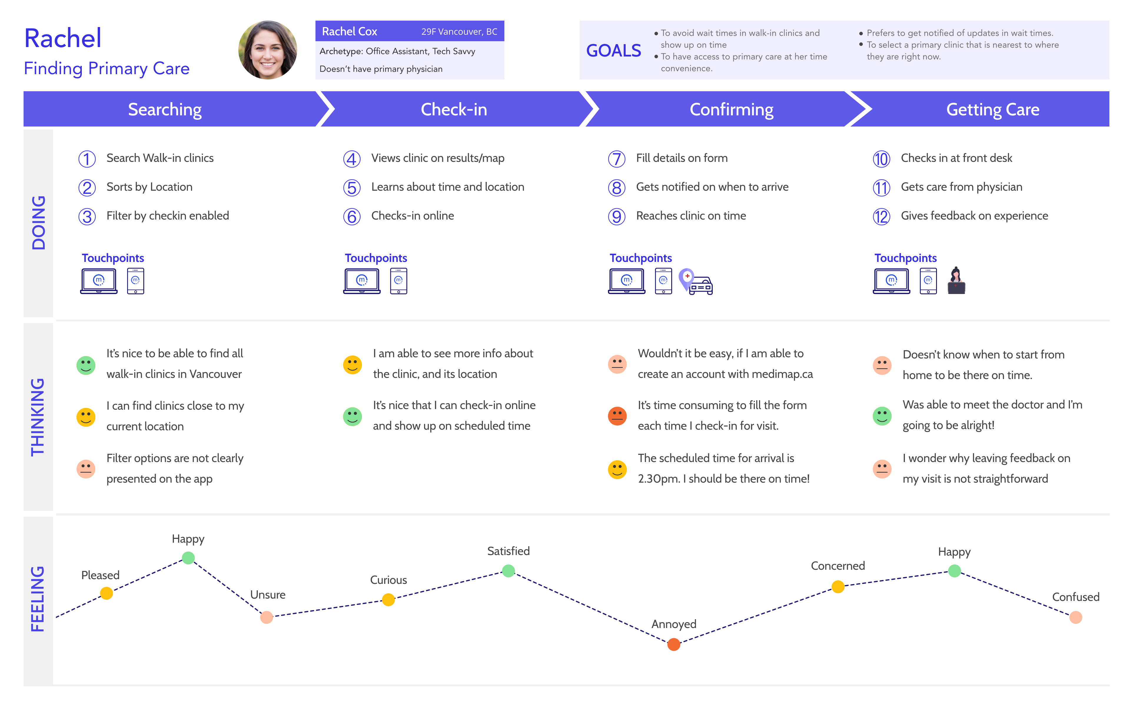
Experience Map
Identified Opportunities

User Feedback
To back my data, I conducted a feedback survey from nearly 10 people in my close circle who have used Medimap for their clinic visits. My findings from the survey are as follows:
◦ App doesn’t show results based on my location
◦ Search by location doesn’t show up previously searched for location/clinic names
◦ Pre-set time to turn off notifications from Medimap is not efficient
◦ Not able to go back to confirm details page when in credit card information page
◦ Doesn’t have a customer service option to reach out for any issues.
◦ People had hard time understanding how to use the app and its features
◦ Filters are unclear on how to set them
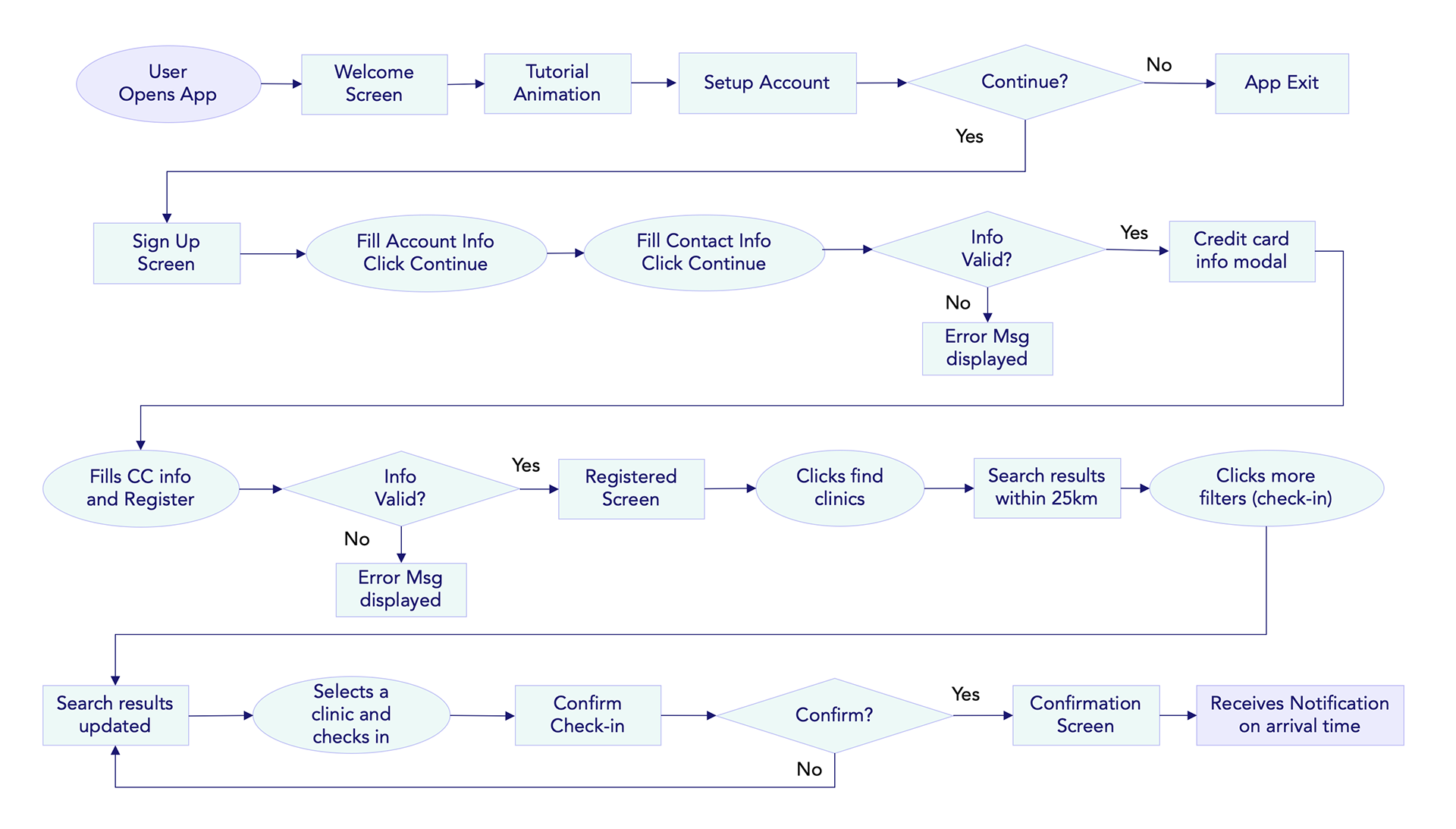
The usability issues and identified opportunities guided the design of my task flow diagram.
Task Flow Diagram
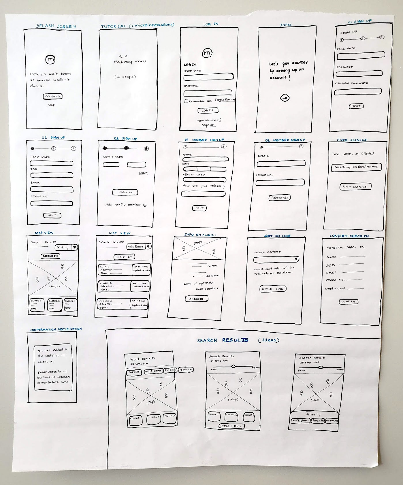
Using my task flow diagram, I started my initial set of low-fi wireframes on paper. My project evolved as I iterated on my low-fi wireframes with a focus on usability and navigation and revisiting my HMW questions. I continued developing my med-fi wireframes on paper, focusing on copy, placement of buttons and access to necessary information/menu on each screen.
Core Task
“New user setting up a Medimap account, searches walk-in clinic and uses check-in feature.”
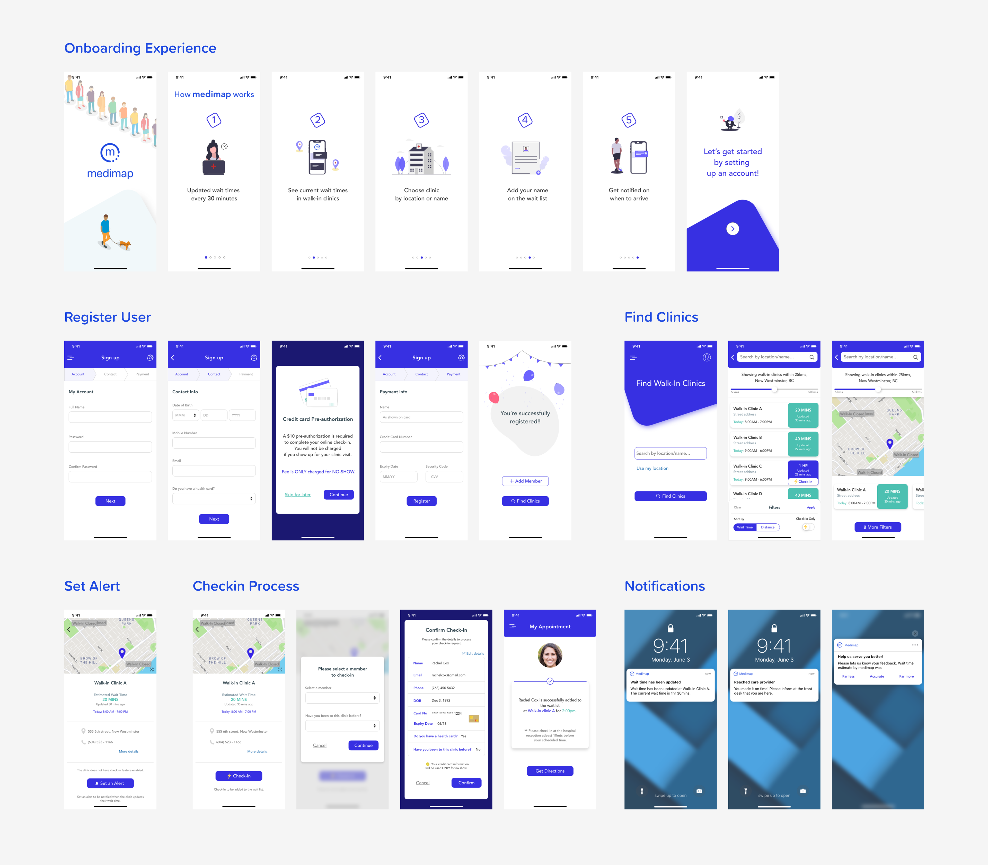
The major step before moving on to digital high-fi sketches was to create a UI library of all the colours, typography and button shapes & states used on Medimap website.
Sticking to brand identity, I translated my med-fi wireframes to high-fi sketches making improvements along the way in regards to copywriting and placement of text. I followed consistent padding and spacing between elements to increase the overall look and feel of the app. I have added micro-interactions to elevate the overall experience of people using Medimap.
I have also developed a prototype to promote hands-on experience using the app.
Medium Fidelity Sketches
HiFidelity Sketches
Micro Interactions
On-boarding Experience
Push Notifications
Register User
Map View and List View
Take Away
“Design is never done” - There is always opportunity for improvement and growth. Moving forward, I would want to work on the identified future enhancements to cover more aspects of health care.
It is always challenging yet interesting to work within the established constraints and brand identity. And I am pleased with the amount of work that I was able to accomplish in 2 weeks of working on this project.
Interactive Prototype
Adobe XD Prototype Link:

Phase II - Medimap Mobile App Re-design
Disclaimer: The second phase of the case-study was done when I worked @ Medimap as part of the mobile app re-design project. The following content is an overview and excerpt of the process and key decisions without going into business decisions and/or customer interactions done in the process. All design screenshots used are from the released app in public domain.
Ubiquitous Design for Medimap Applications
Medimap is going through a transformative phase and breaking new grounds with new experiences for patients and providers alike. Through this rapid phase of development, we have had some challenges in producing synchronized and cohesive visual experiences across our UI primarily due to the parallel evolution of those features within a short period.
The redesign process will bring forward some of those challenges that affect our ability to scale development and design processes going forward - while also including potential forward paths that build ubiquitous design language and brand identity for Medimap across all of our products.
State of current design
There are 7 user experiences based on medium of access, which can be categorized by the customer type that it's targeted to.
Patients: Walk-In (web), VirtualCare (web), Walk-In (mobile-web), VirtualCare (mobile-web), and Walk-In (mobile app)
Providers: Clinic Portal (web), Clinic Portal (mobile-web)
Goals for Mobile App Redesign
○ To kick-start a new ubiquitous design language and design system that will adhere to brand identity
○ Building a design system and component library that will drive consistency of design across rest of the application re-designs (Clinic Portal 2.0 and Website)
Design Language and Building Brand Identity
At this time when we are seeing ever-increasing adoption of Medimap’s platform by providers and patients, there is an opportunity to establish our identity and values through cohesiveness and consistency in our user experience. A design language is an unspoken yet ubiquitous protocol a brand exhibits on every facet of their products - evoking consistent emotions and a feeling of familiarity across their customers. Brand identity and awareness are merely long-term by-products of maintaining the design language consistency over a long period.
As with most growing companies, there exists a design dilemma of how may we achieve our brand identity through the design process while at the same time, being able to deliver features to customers at a brisk pace. The following section details the two potential approaches we can take to build towards the desired future.
Dilemma of - Incremental Consistency vs Eventual Consistency
Incrementally Consistent With Design Language
We start with a basic design system and slowly build one product adhering to a common design language that looks cohesive and consistent. This approach assumes that the team constantly self-regulates on adhering to the end goal as the design system evolves along with the product itself. This would mean the agreed guidelines are propagated incrementally to all product screens as we develop/enhance/feature-add or bug-fix them.
Positives: No upfront task of creating a design system, or doing a large-scale design consistency redo on all product screens.
Drawbacks: This is akin to building a bridge from two sides, requires conscious effort to adhere to the end goal even if we are tempted to take a quick path to use an existing component when we are addressing a feature on that page.
Eventually Consistent With Design Language
We start with a comprehensive design system that covers all bases (typography, buttons, form elements, iconography, spacing guides, color palette, page grid system, card/container layouts, reusable components). This approach has upfront effort but provides a clear vision towards where we are headed to. Driving consensus on design ambiguities becomes easier and developers get accustomed to a common design language and build internal familiarity. All new website features we develop will follow the new guidelines, except that we do not embark on a complete redesign on Mobile App (which has a consistent experience).
Positives: No ambiguity on the end goal, and everyone aligned on the design language internally. We see the bridge, we build the bridge :)
Drawbacks: The upfront task of creating a design system, followed by a redo of top-level pages to match the design language.
Path Towards Design Ubiquity
"We choose to embrace the agile and incremental development model and embark on an incremental consistency in design. Redesign of the mobile app will be the first step towards the end goal of attaining an ubiquitous design language for Medimap"
High Fidelity User Flows
I designed and launched the platform agnostic mobile app for Medimap users to access services on the go. Led a complete redesign of the app by driving consensus on ubiquitous design language, brand identity, design system and a delightful UI to enhance the experience. The following sections are categorized user flows in the app at its final released form.
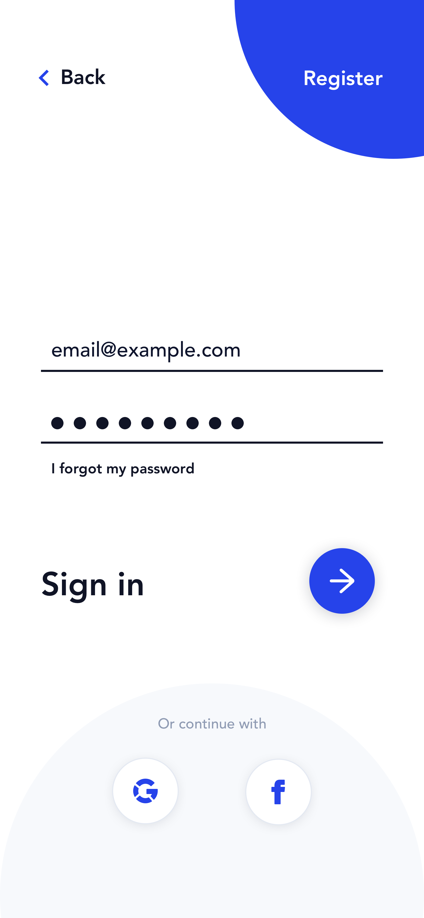
Landing Screen and Authentication

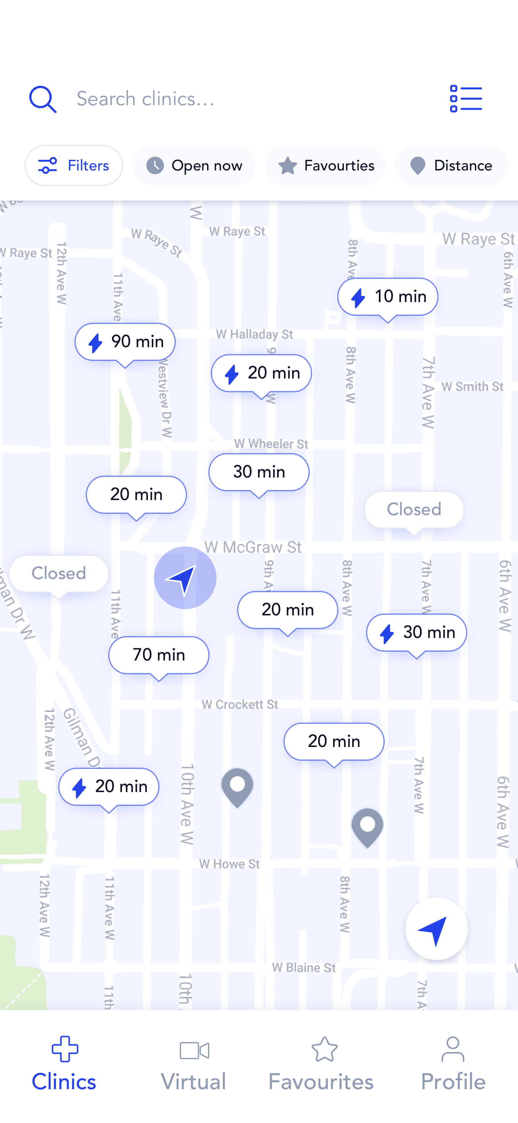
Find Clinics Near You
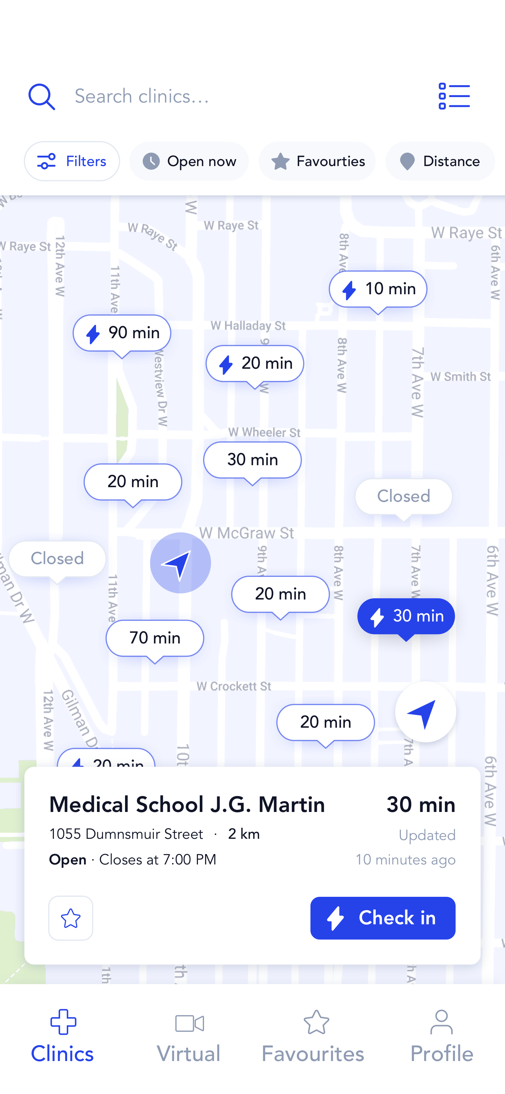

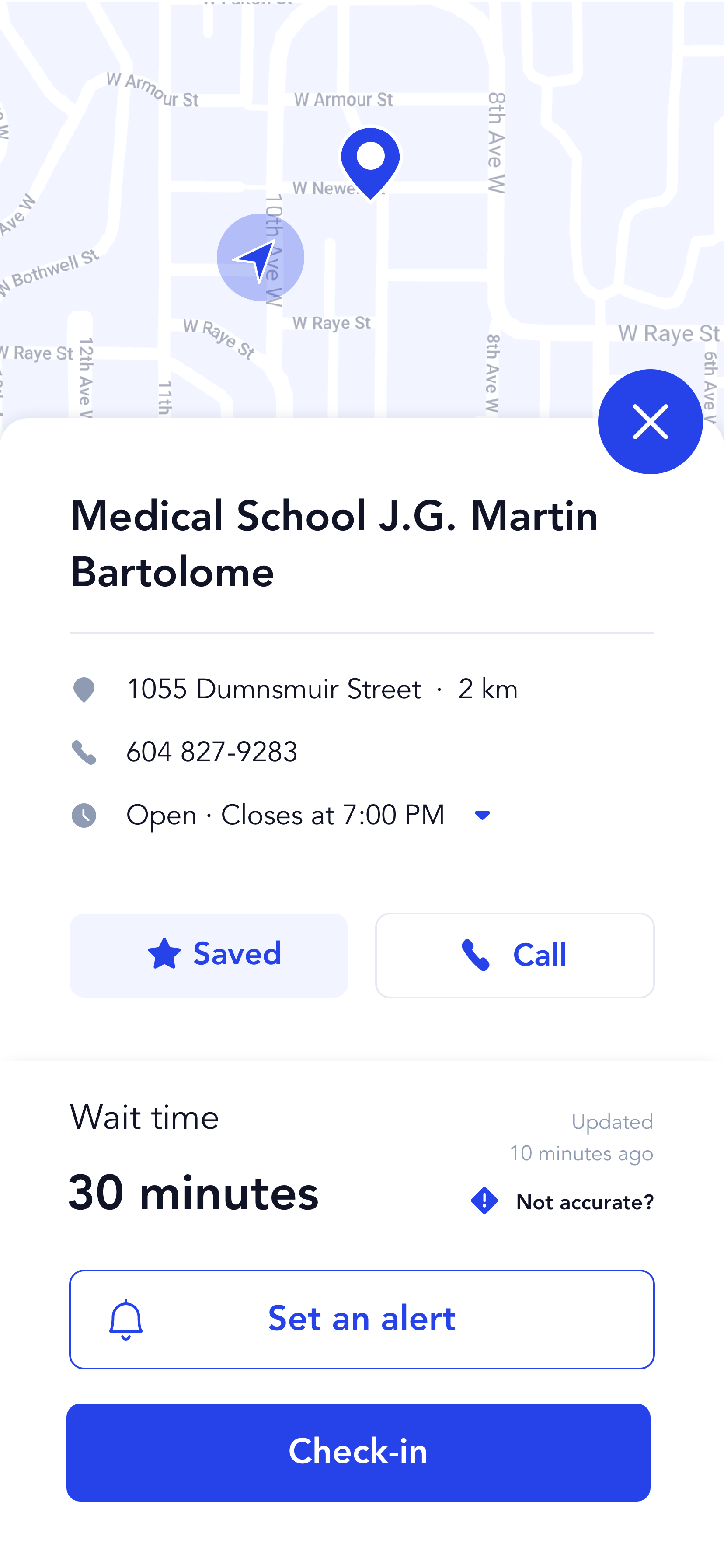
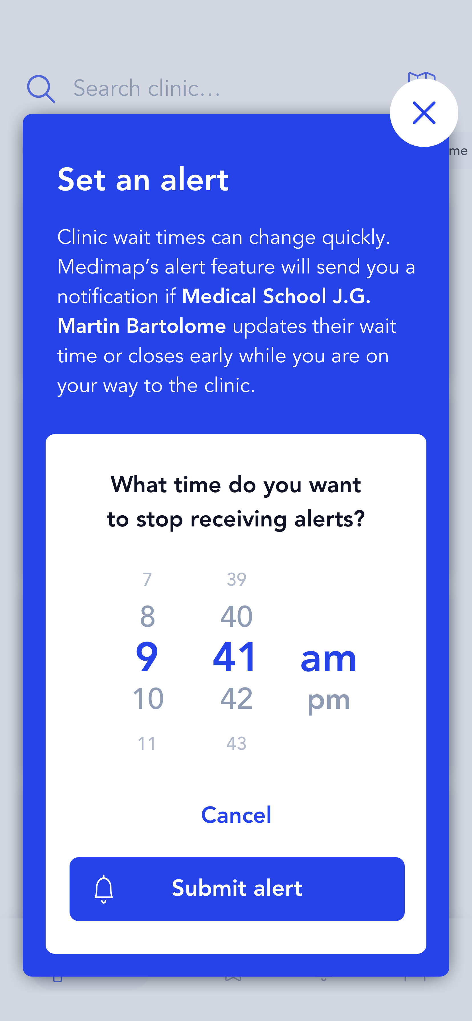
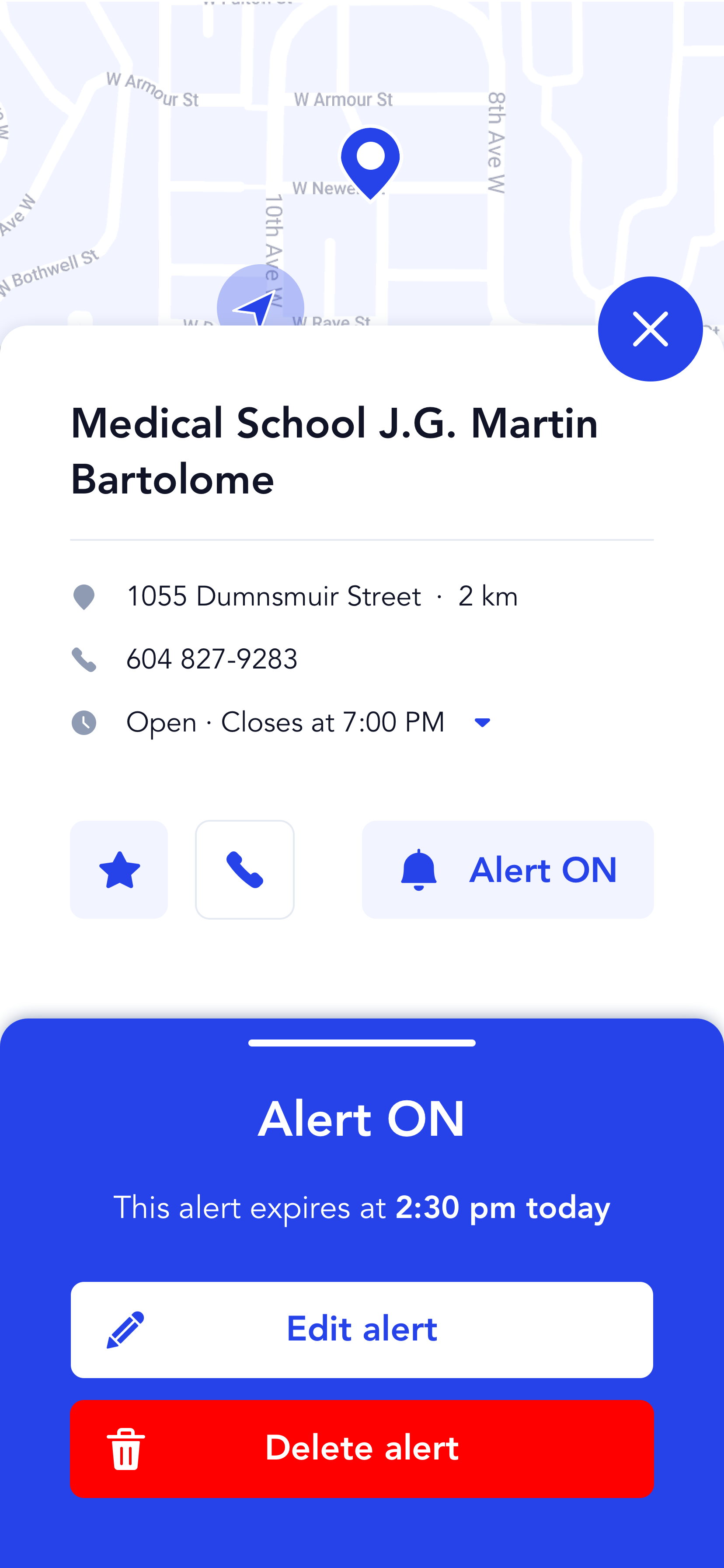
Clinic Details and Set Alerts
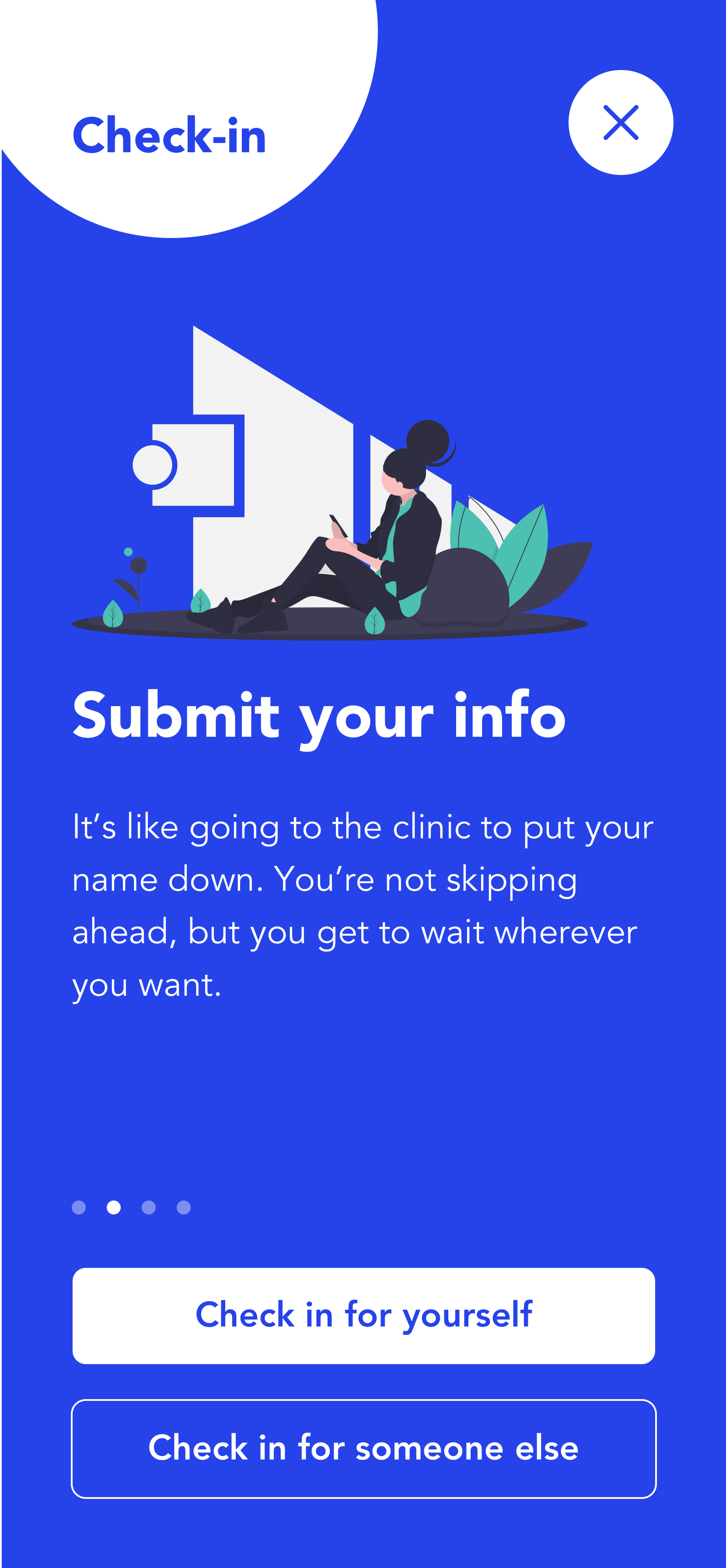
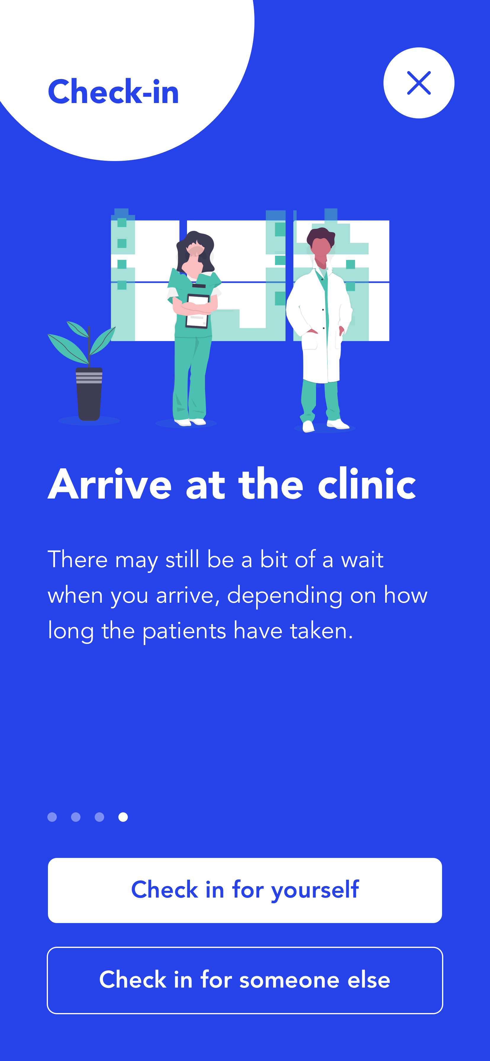
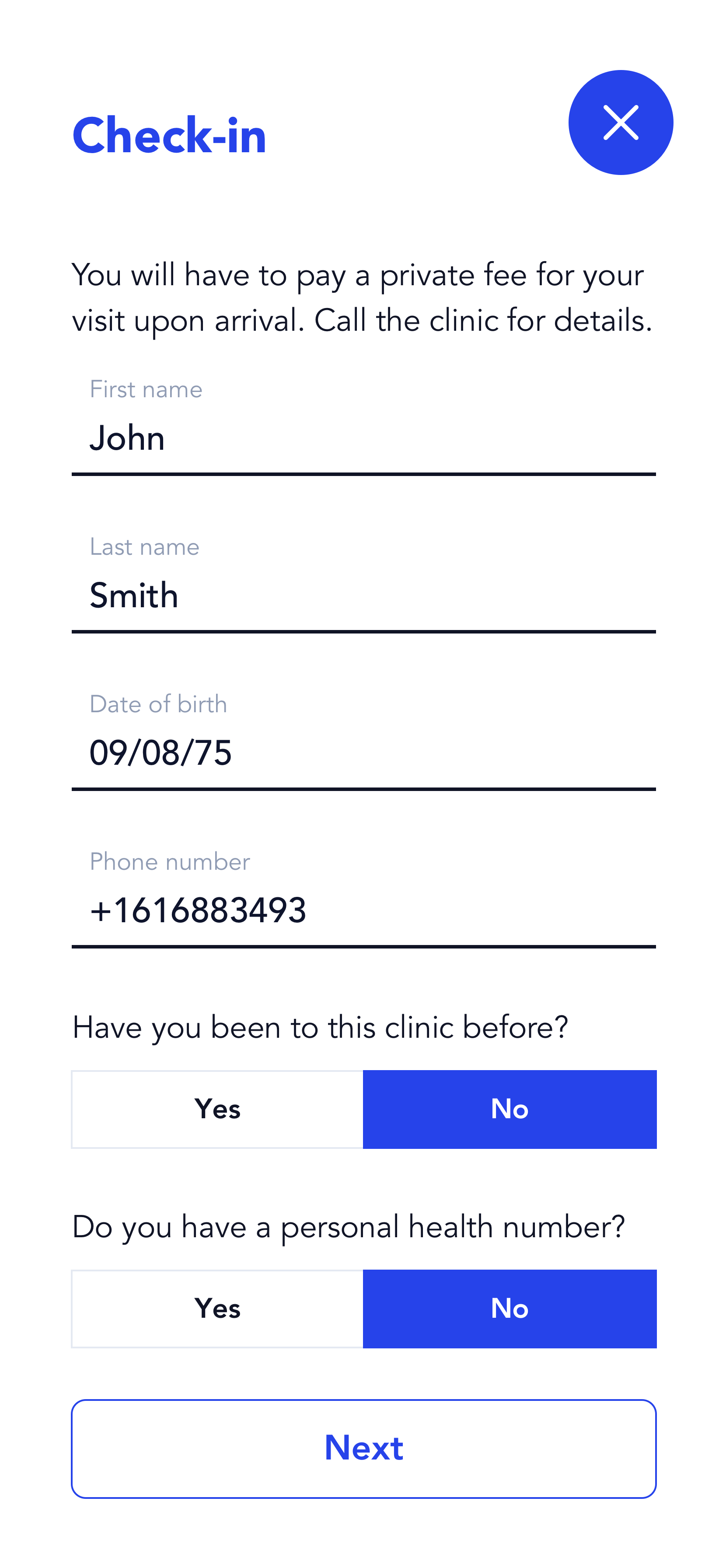
Check-in Onboarding - First Time Experience


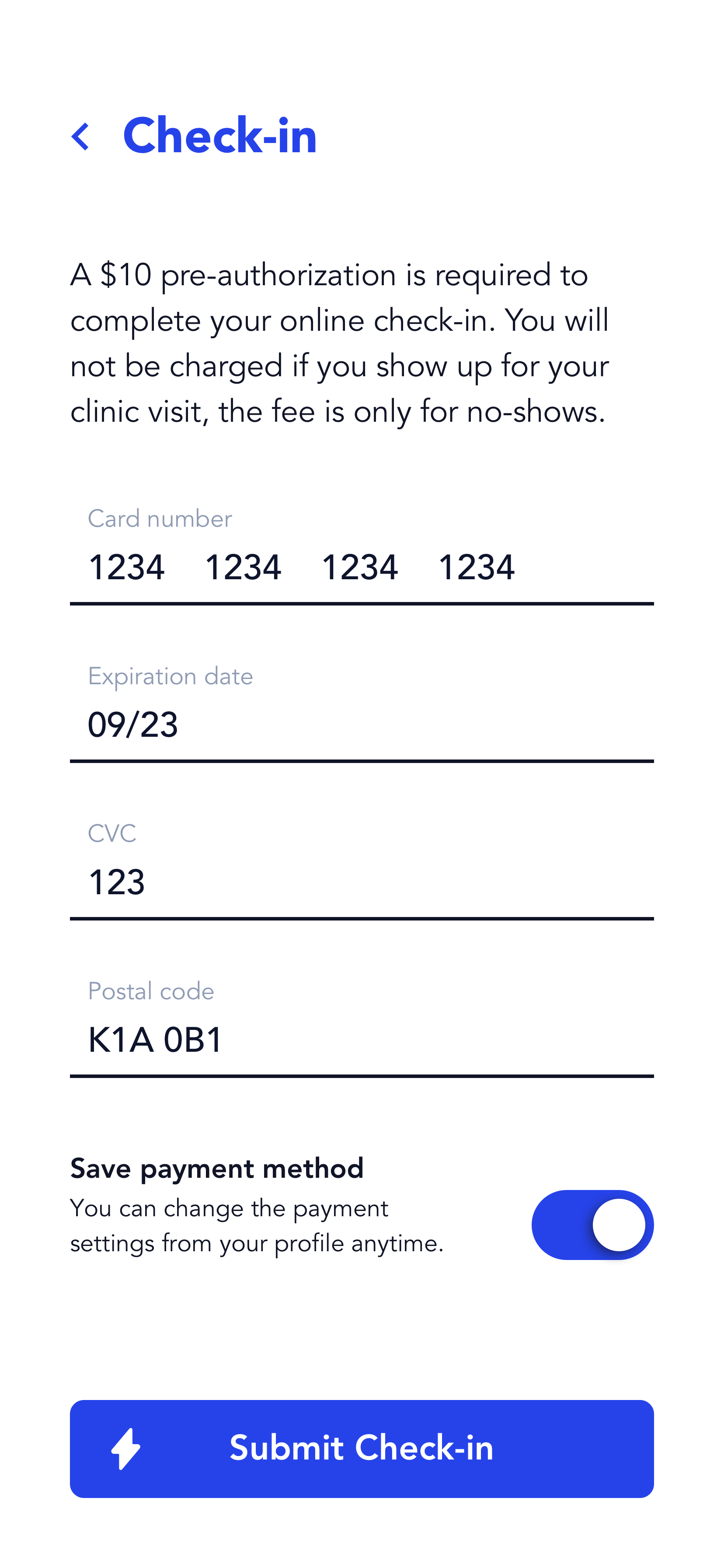
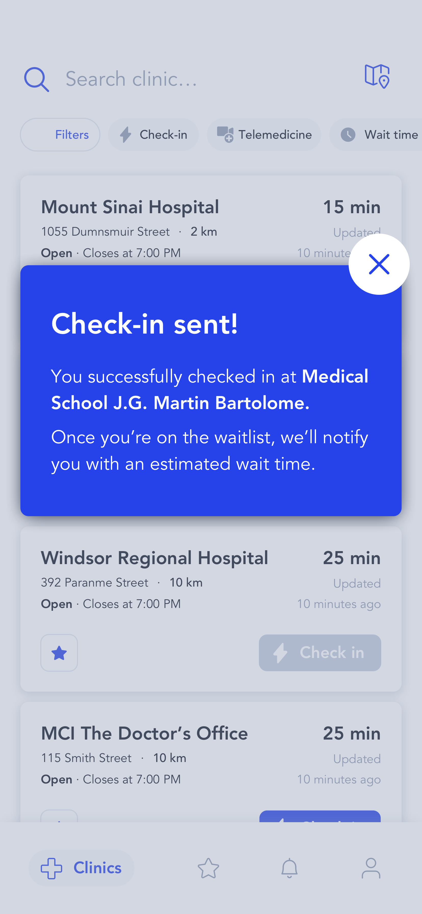
Check-in Experience
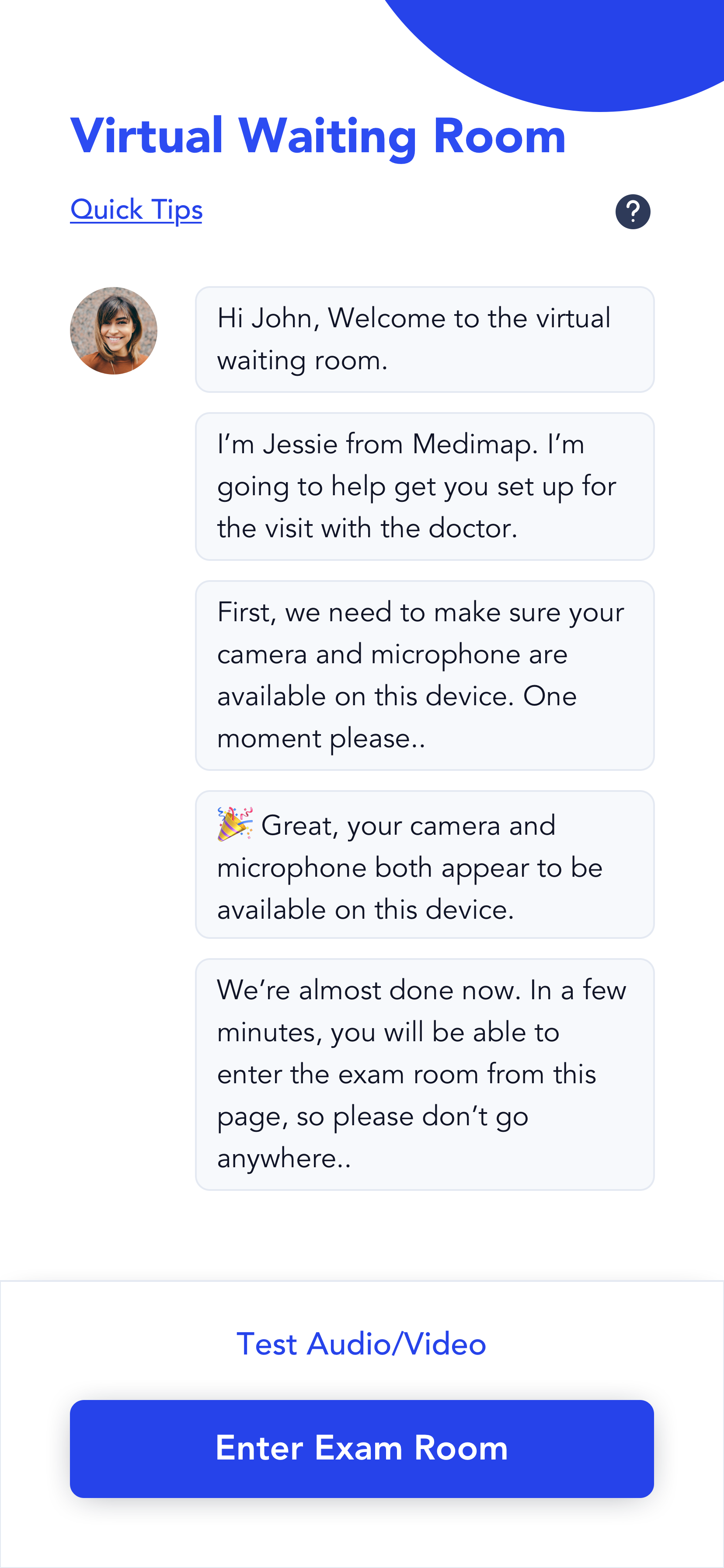
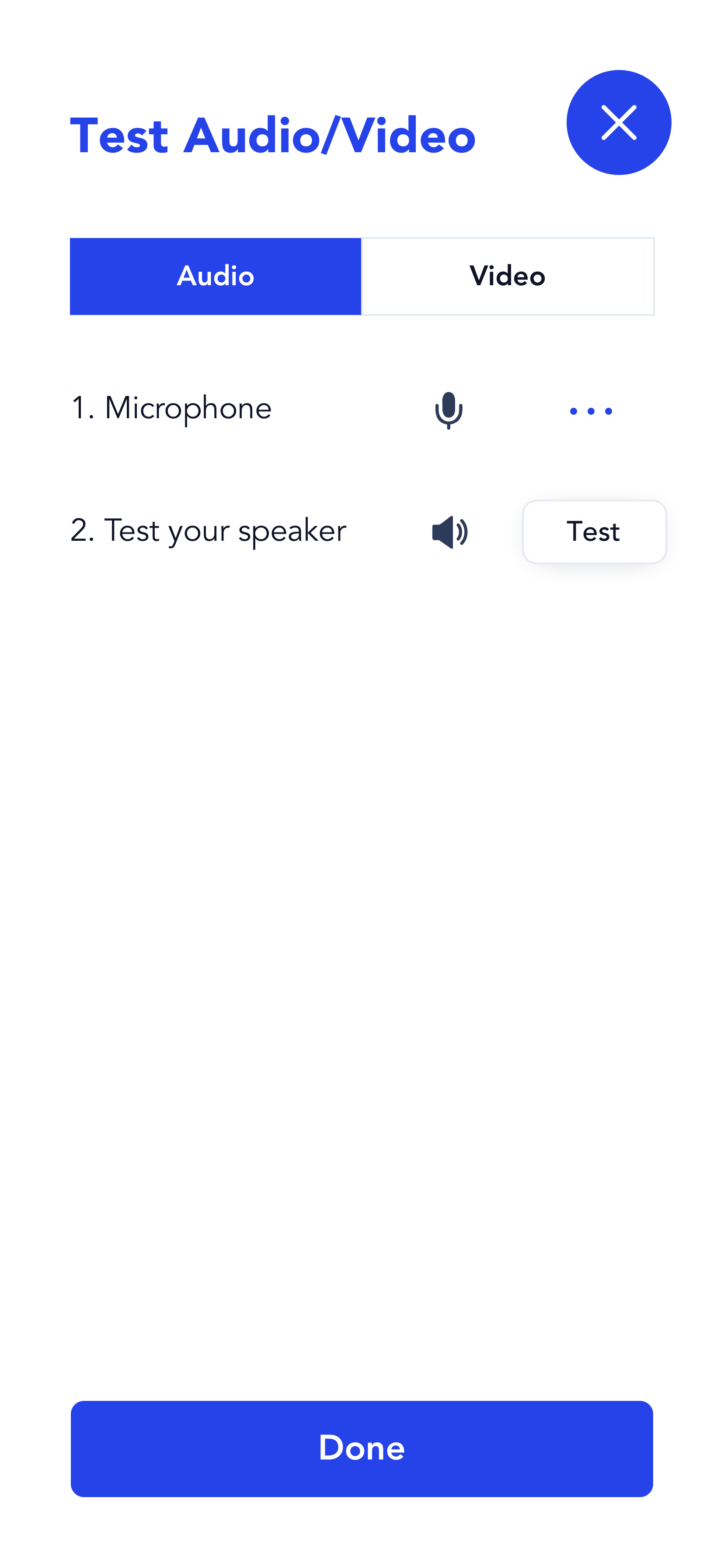
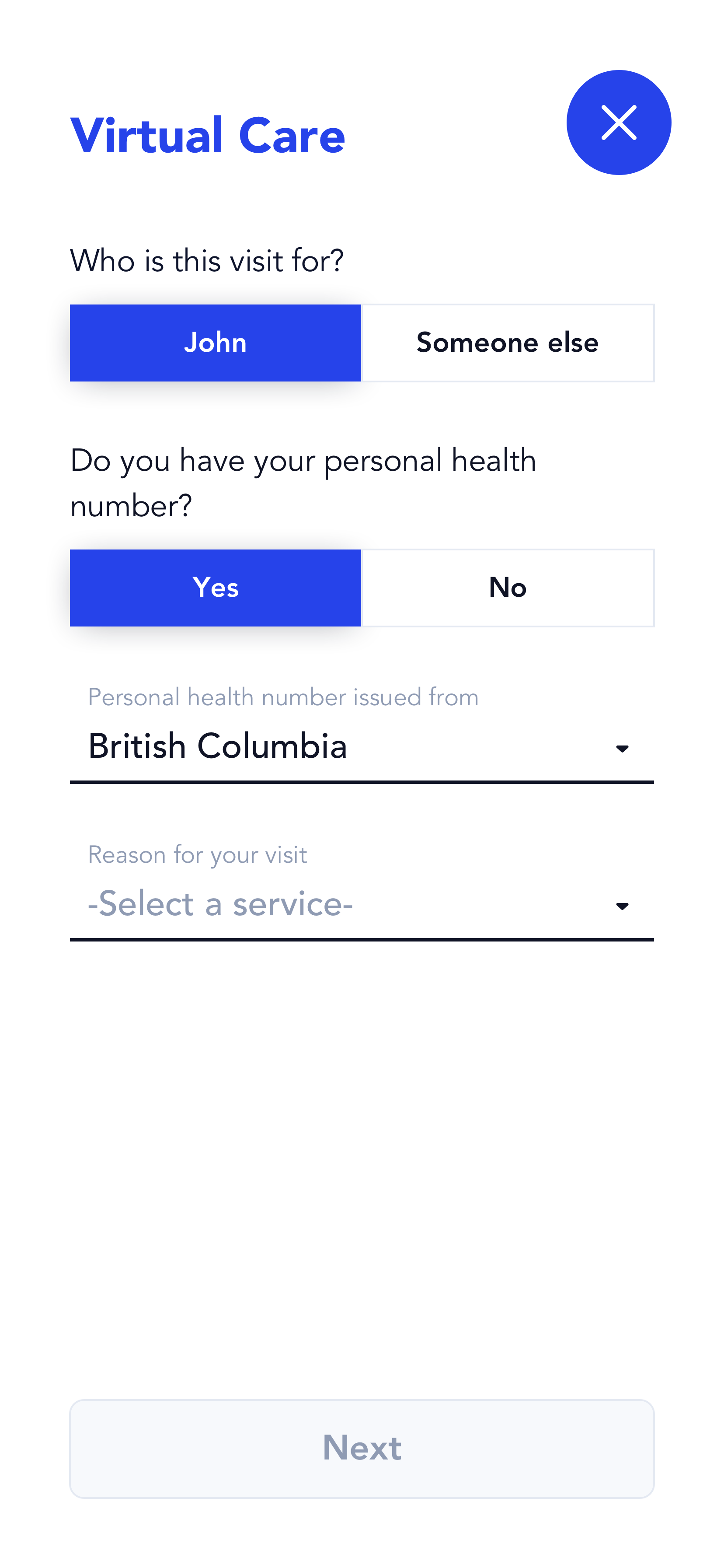
Virtual Care Intake Experience

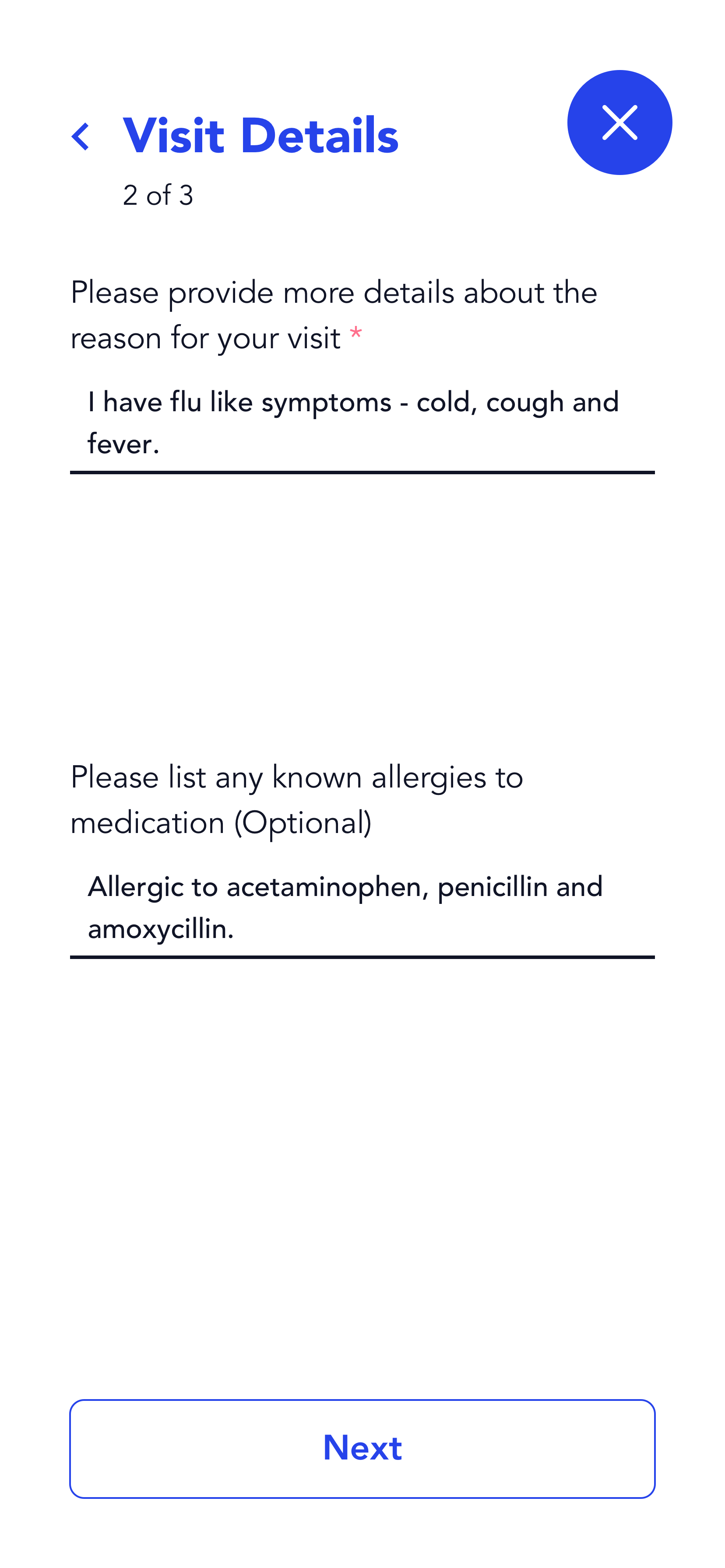
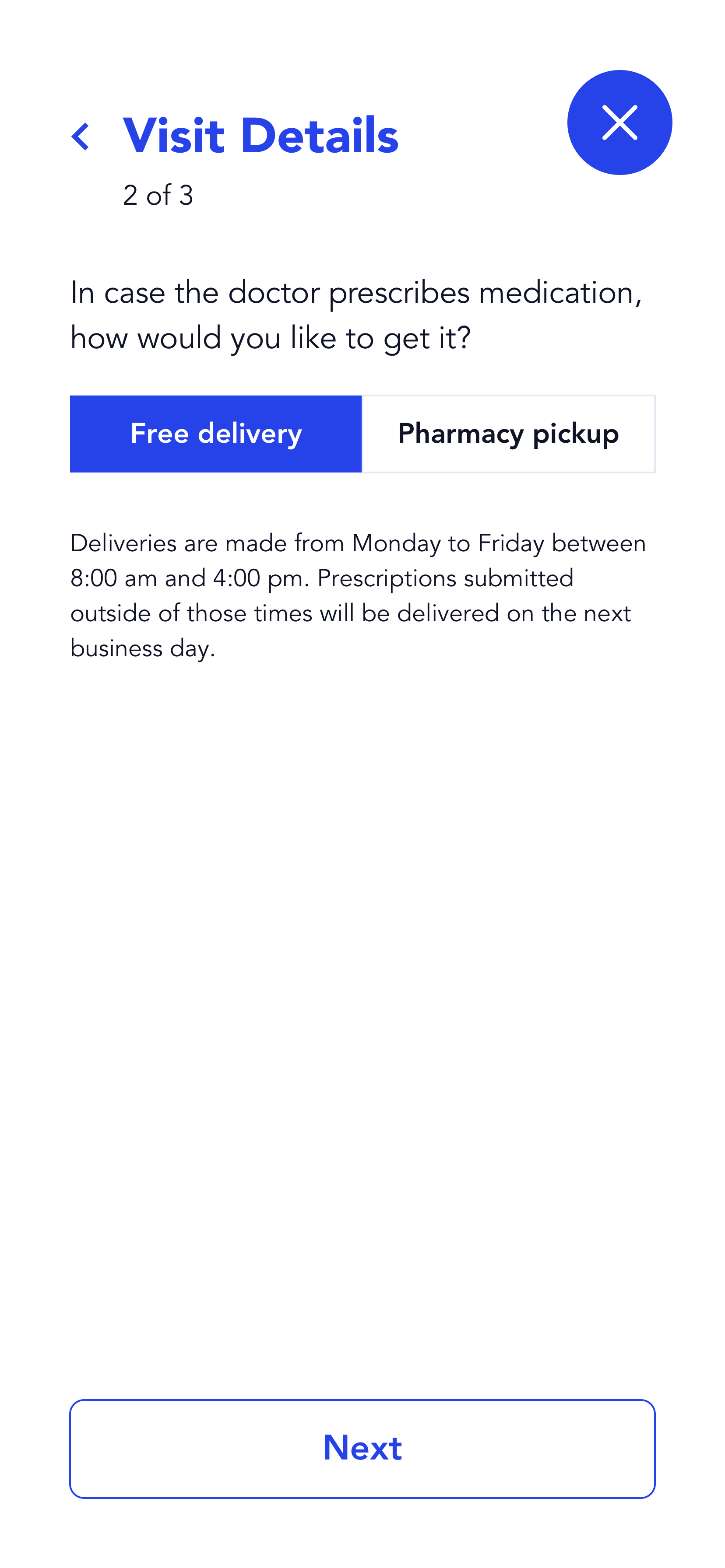
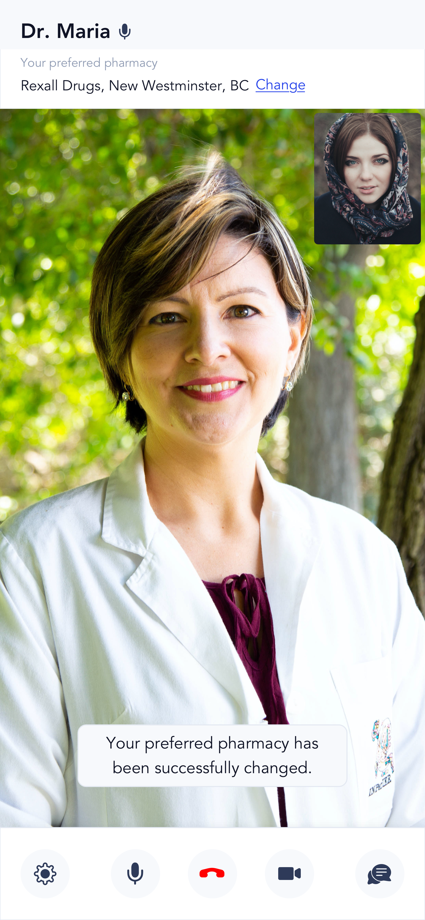
Virtual Care Session Experience